PROJECT FOCUS
Product branding
Responsive web design
Responsive web design
PROJECT ROLE
Product designer
Product designer
TIMELINE
5 days
5 days
TOOLS
Sketch
Invision
Sketch
Invision
DESIGN CHALLENGE OUTLINE
- Design a product marketing website for BrainStation’s Capstone Project
- Be able to optimize web content for use on desktop and mobile viewports
- Translate product’s brand look and feel to a different medium
- Be able to optimize web content for use on desktop and mobile viewports
- Translate product’s brand look and feel to a different medium

PHASE 1 _ DISCOVER
The goal of this project is to speak to CV’s simple and minimalistic design structure (see CV’s case study), while still containing all necessary content to provide to the user. In the first phase, we will be exploring precedents to gather inspiration, and synthesize our findings to create our own content flow.
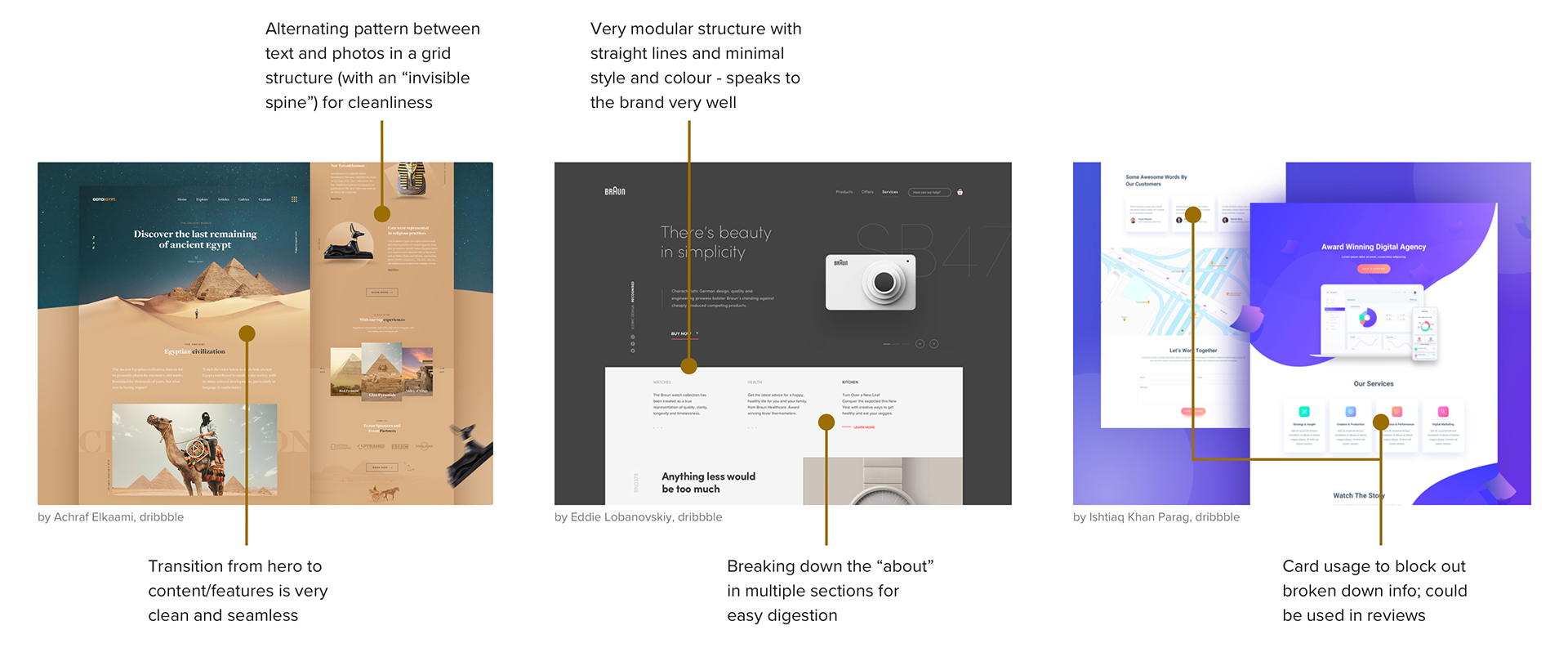
INSPIRATION
It was important that this project could include elements to organize text heavy content, while still being able to translate to a smaller device screen. Here, I explored how other web designs used cards and/or blocks to break down heavy text.
When considering a product page, it was important that the storytelling aspect would be smooth as well. I considered how I could translate that graphically, while still maintaining CV's structured design.
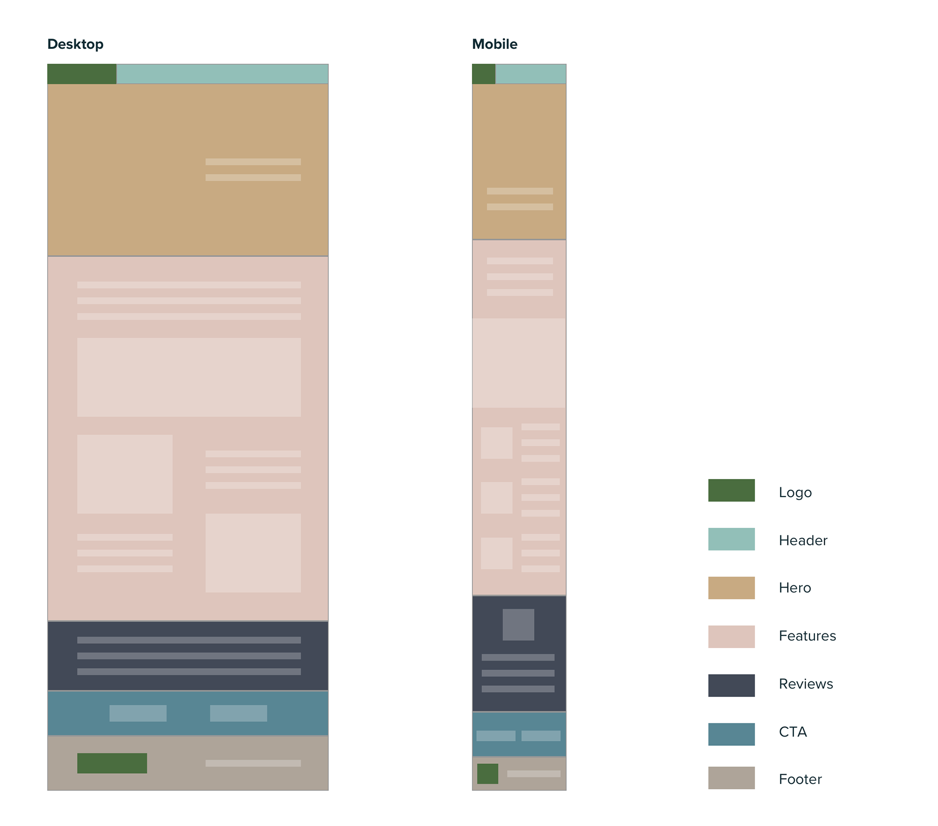
CONTENT FLOW DIAGRAM
After studying examples and gaining inspiration, the next task was to synthesize all the information gathered. As seen in the following diagram (see right), I colour blocked sections to organize the website content.
The challenge here was to translate and condense the information from desktop to the mobile version while maintaining the flow of the story.

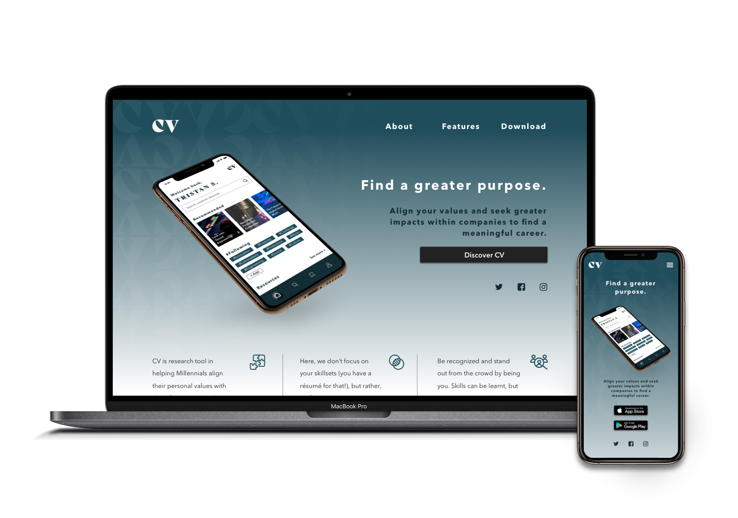
PHASE 2 _ DESIGN
LOFI WIREFRAMES
Moving into phase 2 of the project, lofi wireframe sketches were created by translating the content flow diagram. Following the same structure, I created two wireframe options, both focusing on minimalism that speaks to my brand, and putting emphasis on the visual aspect as seen in the inspiration images collected earlier.
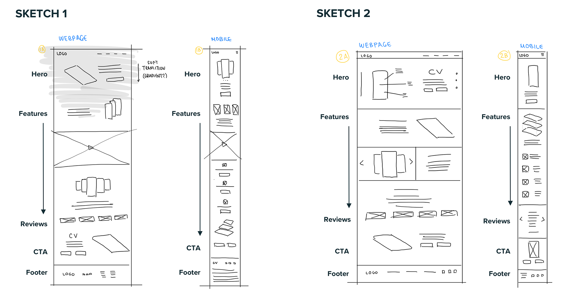
MID-FI DESIGN
After gaining feedback/insights from peers, wireframe Sketch 1 was more preferable. However, I personally liked the simplicity of Sketch 2 - as the layouts were similar, I combined the two wireframes into the following medium fidelity design.
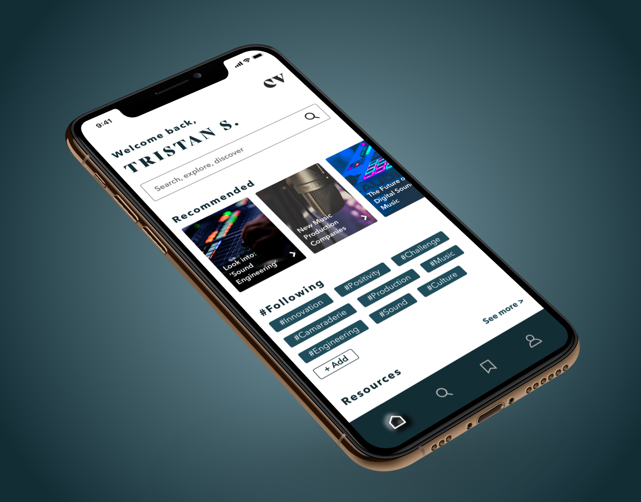
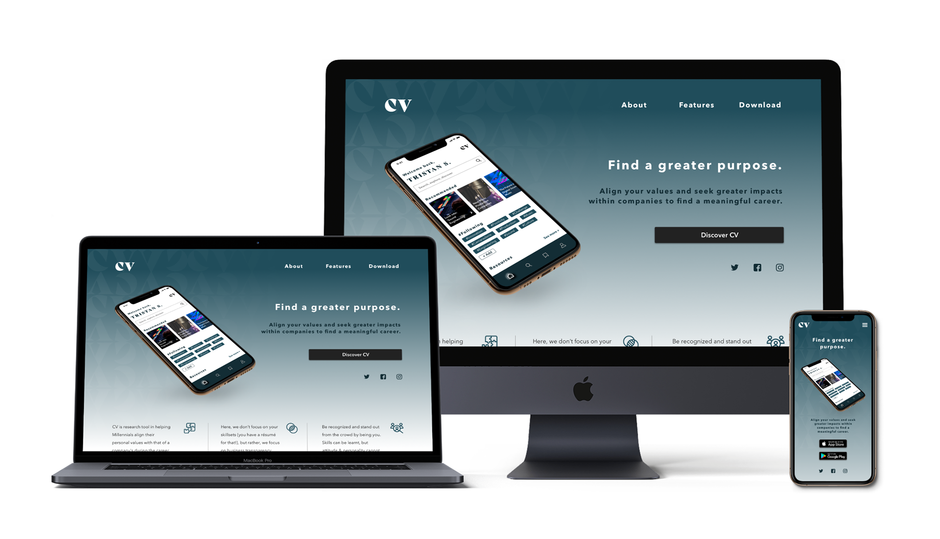
HI-FI DESIGN
Fortunately, the mid-fi design seemed appealing to peers, and it was recommended that I jump into hi-fi to add colour, context, and images in order to bring the design to life. This way, the audience had a better understanding of the story and content flow.

PHASE 3 _ DEVELOP
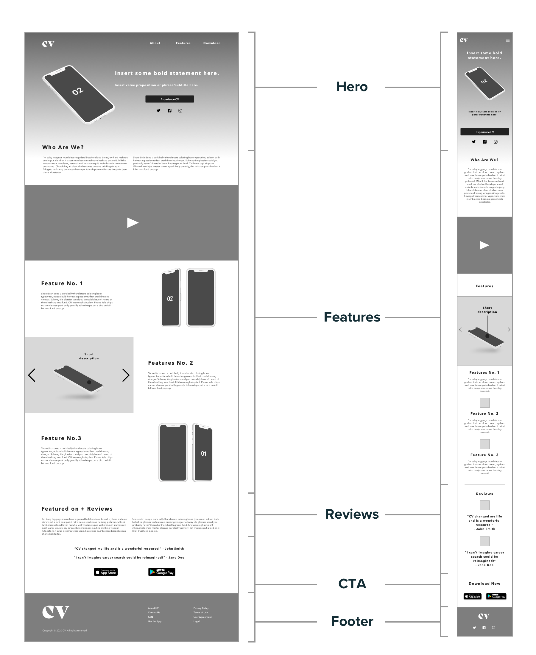
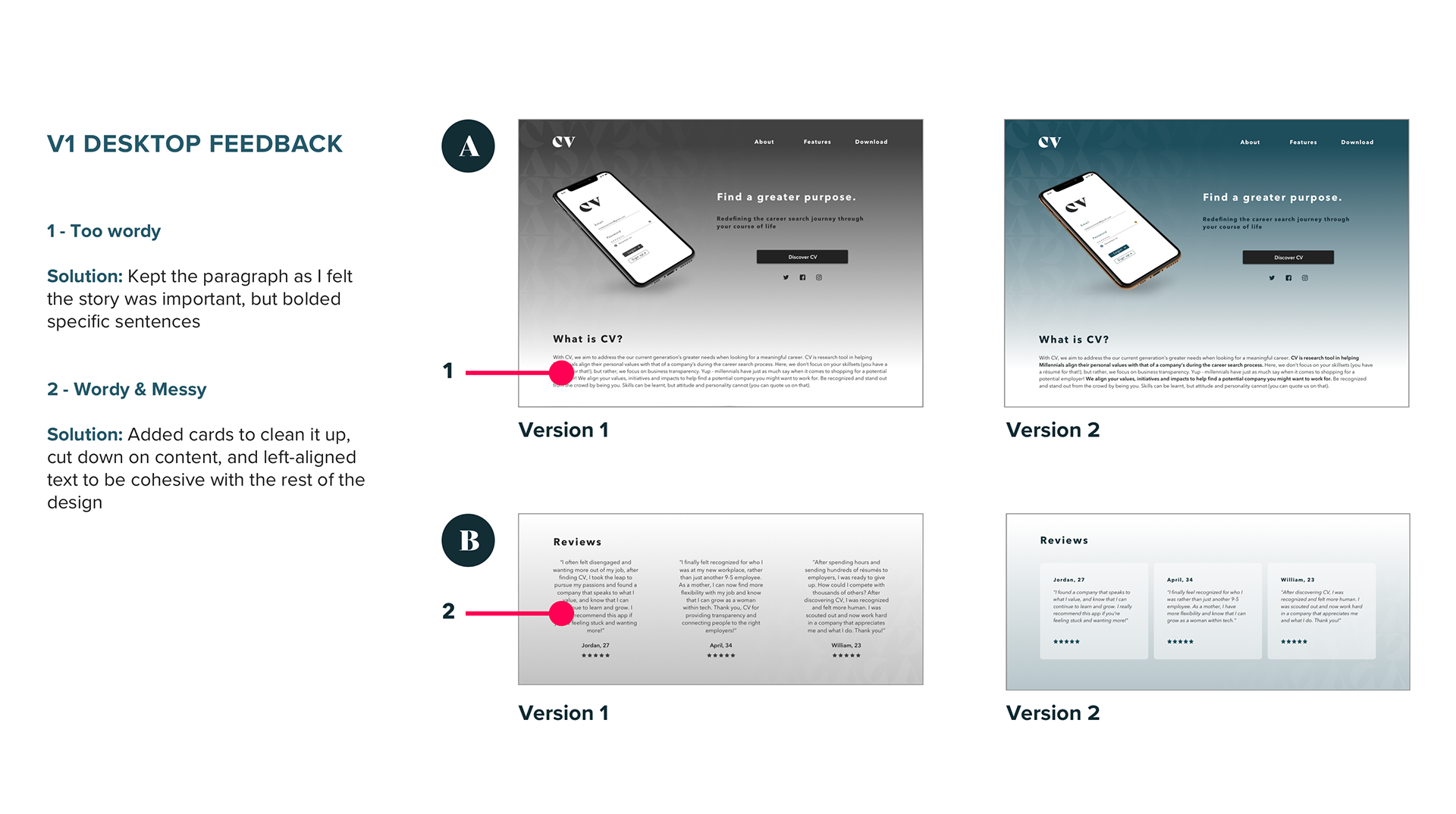
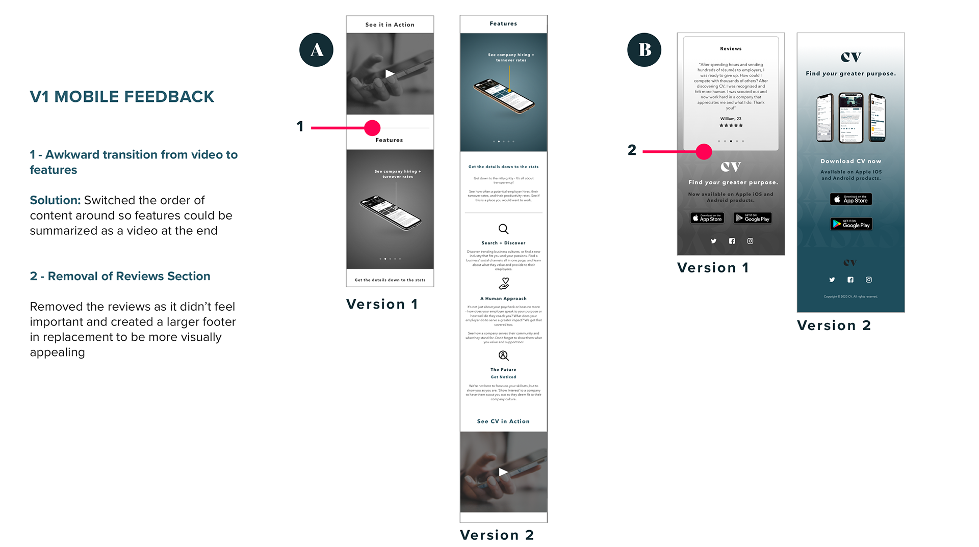
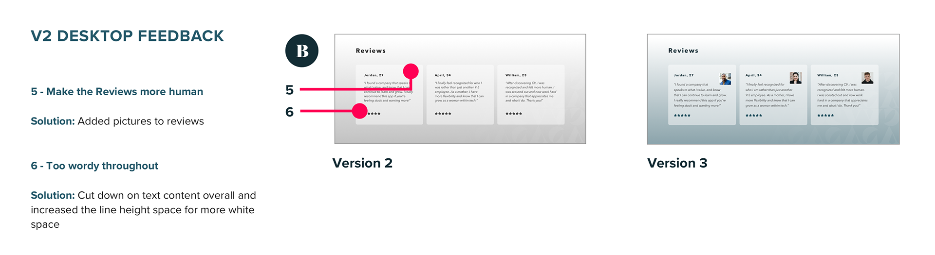
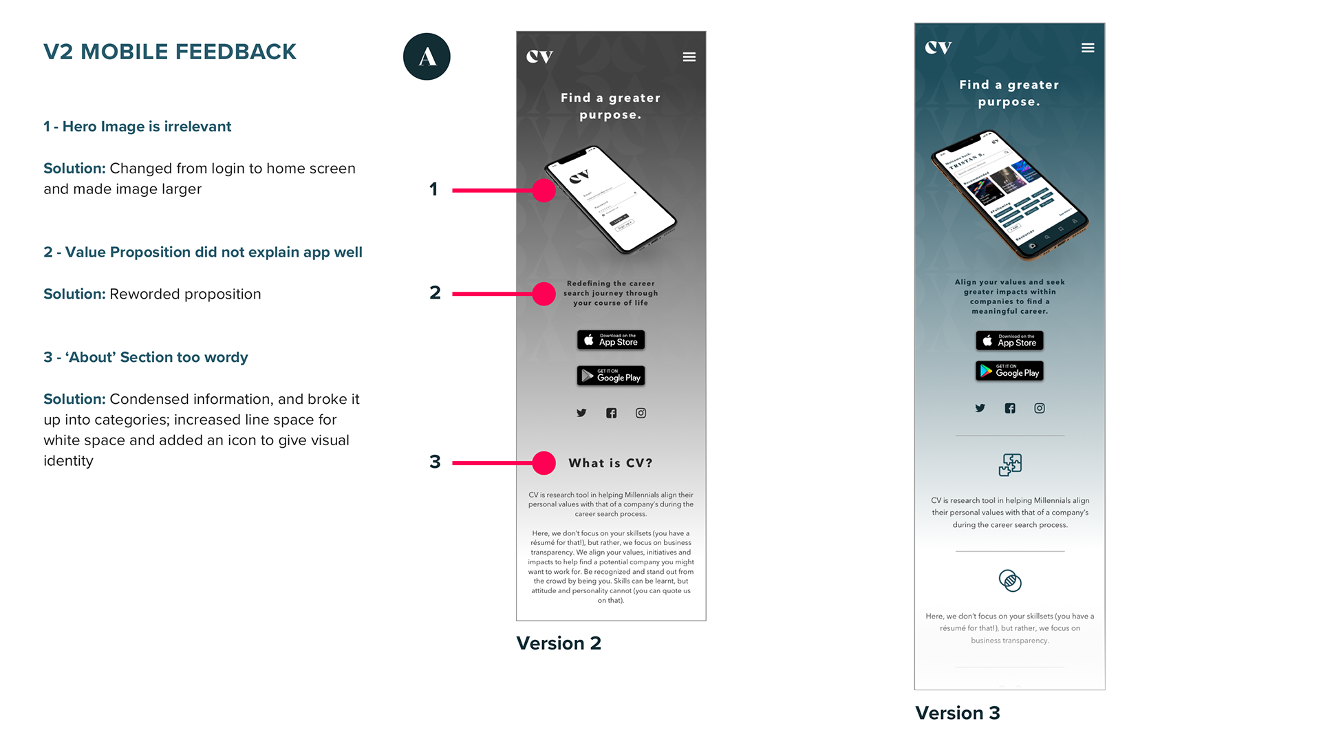
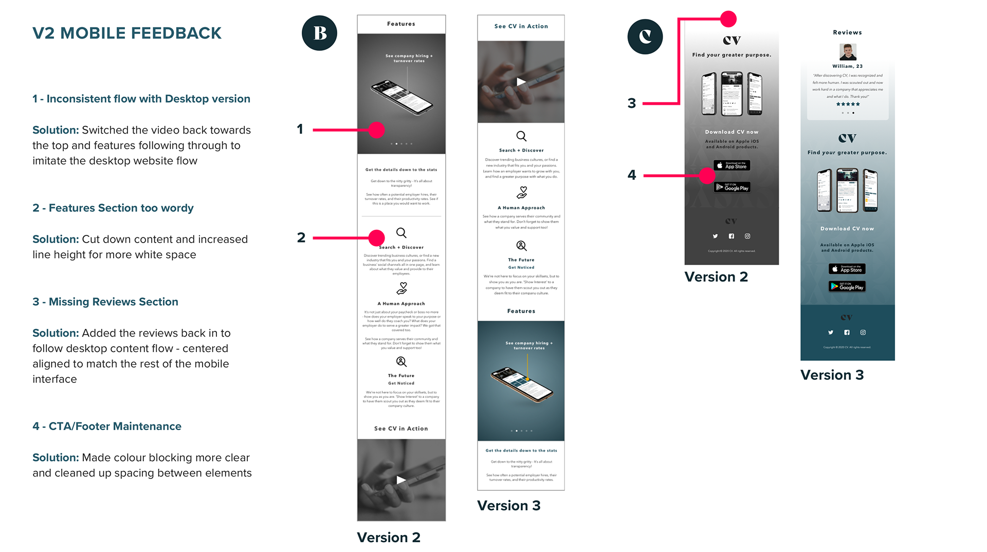
USABILITY TEST NO. 1
Through development of the design, I conducted two rounds of usability tests with peers. In the following annotated images, we will see the process of feedback reported from users and how the problems were solved to create a second iteration of the design.
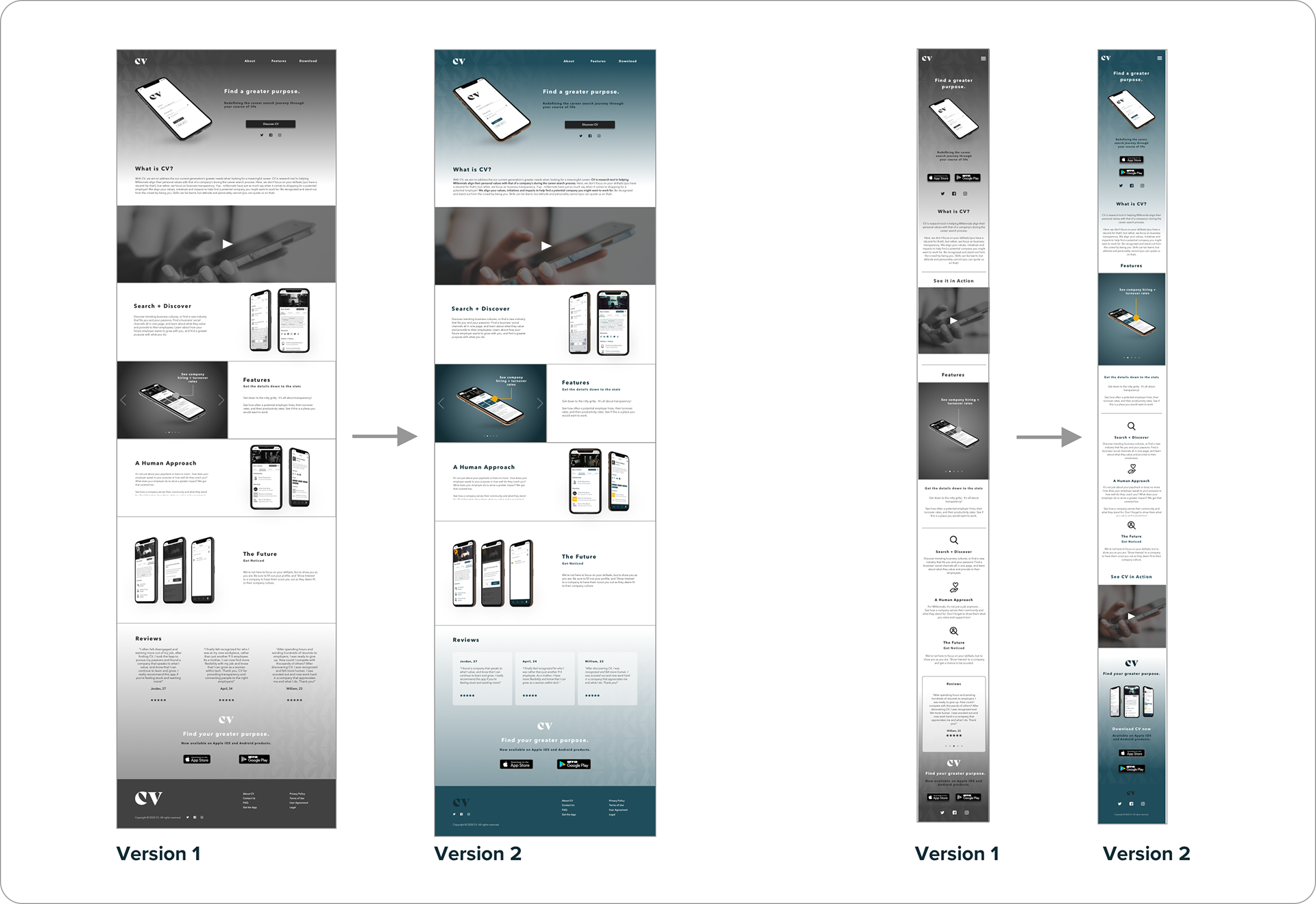
Here, we see a side-by-side comparison of the content flow. In V2, the interface becomes cleaner with the cards at the bottom, and the mobile version feels more balanced with content.
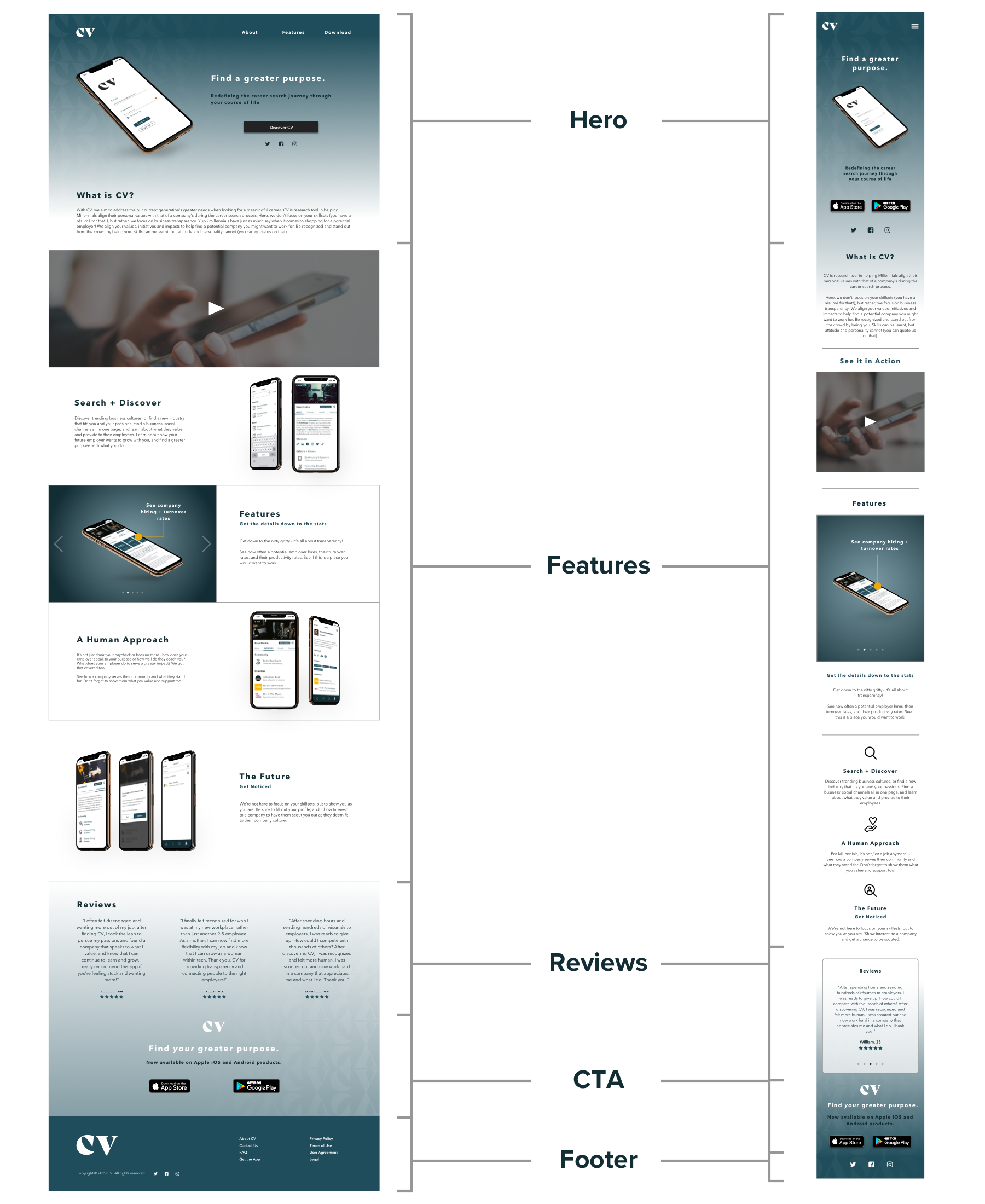
USABILITY TEST NO. 2
After the initial changes, I was feeling pretty confident about the design changes! To my surprise, after conducting the second round of usability testing, I ended up getting more feedback than before. This really challenged me to push my own boundaries of how to condense information, and see my design from a different perspective.
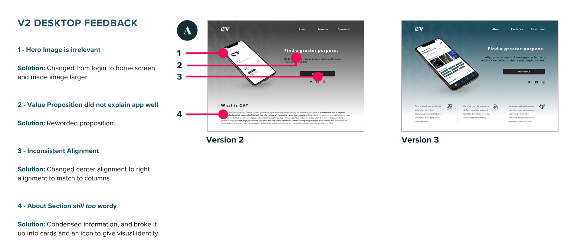
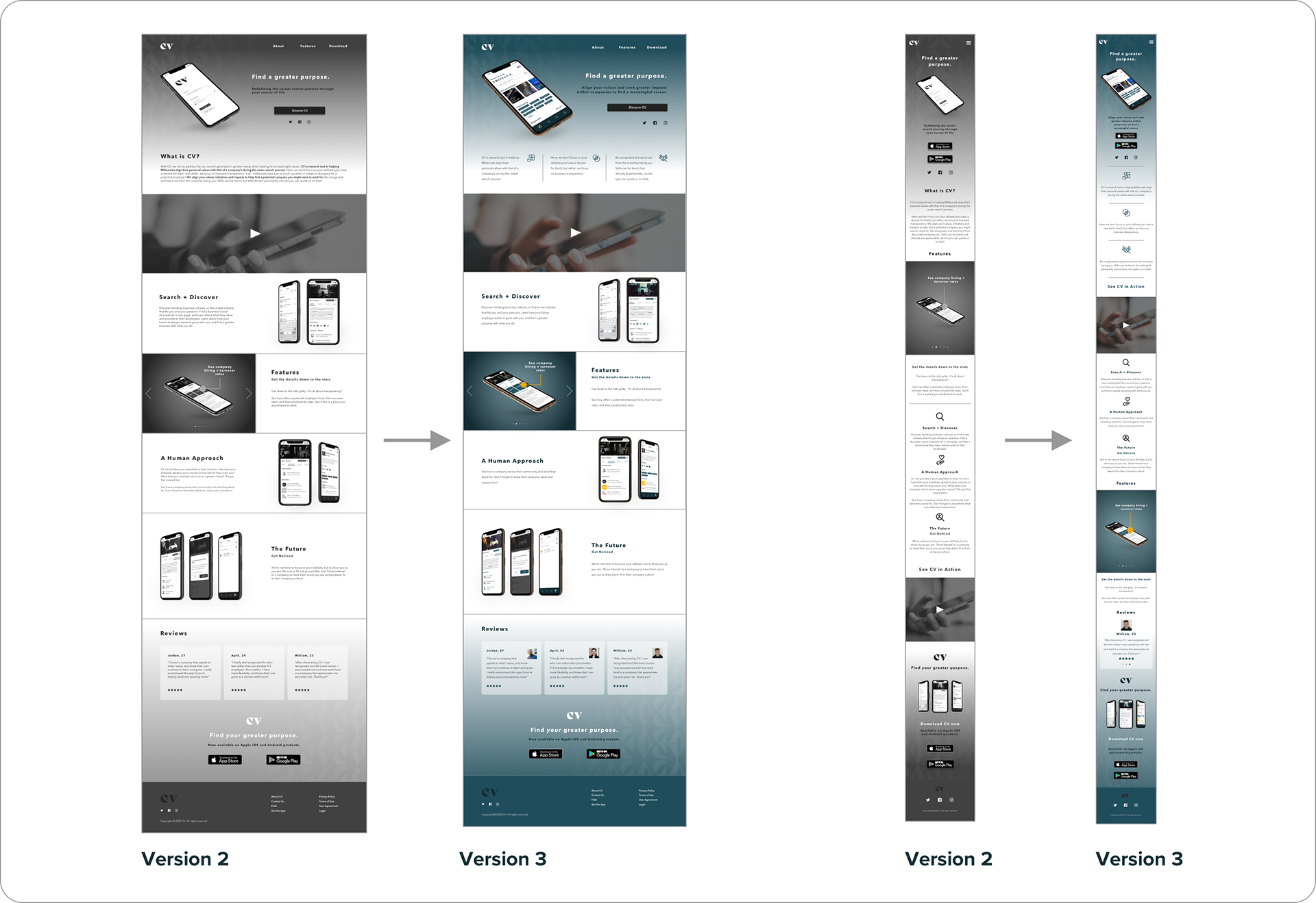
Here we see a side-by-side comparison of V2 and V3 layouts. It’s noticeable how V3 has a lot more condensed information and more white space. The V3 mobile version also has significant changes in the layout due to shifting sections and re-adding previous elements that were previously removed. Overall, V3 provides a much cleaner interface that is easier to read and follow.

PHASE 4 _ DEPLOY
Through the usability testings and feedback received, I was able to learn and design an optimized web page for different mediums. The feedback helped me take a step back to see things from a different perspective and helped me translate the product’s brand look and feel better.

KEY LEARNINGS
FEEDBACK
- Always be open to feedback and constantly ask for it no matter how confident and/or comfortable you feel about your layout and design, there’s always something to improve
SYNTHESIZING + TRANSLATING
- Translating web to mobile is very different and very difficult, both have their pros and cons (ex. alignment, spacing, transitions and features)
- Be careful when condensing and seeing what info to take in or out and how moving content around can change the storyboard/flow of what you’re trying to communicate
- Be careful when condensing and seeing what info to take in or out and how moving content around can change the storyboard/flow of what you’re trying to communicate
HAVE FUN
- Have fun and enjoy the process! It's a journey of discovery and exploration, and as a product designer, we have the advantage to iterate until we have the desired outcome