PROJECT FOCUS
User research
User interface design
User research
User interface design
PROJECT ROLE
Product researcher + designer [end-to-end]
Product researcher + designer [end-to-end]
TIMELINE
10 weeks
10 weeks
TOOLS
Sketch
Invision
Sketch
Invision
CV is a resource that helps Millennials align their values and seek greater impacts within companies to find a meaningful career.
DESIGN CHALLENGE OUTLINE
- Identify, plan, research, and design a digital mobile interaction that attempts to solve a problem space of one's
choosing
choosing
- Translate rough sketches into a grayscale wireframe + interactive prototype
- Assess the usability of the designs through usability testing
- Develop + design a brand for the digital product

IDENTIFYING THE PROBLEM SPACE
When thinking about what problem I could solve, I decided to pick a problem that hit close to home. I was young and not sure how to go about choosing a career, as I came to a quick realization that I didn’t enjoy what I previously studied. Talking to many others around my age, a lot of them weren’t happy with their current jobs/careers or didn’t know what they wanted to do. Most of them did not feel passionate about their career path, and many of my friends didn’t have a good understanding of what they liked/disliked or their strengths/weaknesses and how it could shape into their career.
As our jobs take up most of our time, it’s important that we are able to identify what we want to do in order to pursue a career that is meaningful to us. The first step to achieve this is being able to understand ourselves:
“Career identity is indicative of the current career being pursued, whereas vocational identity represents an
identity related to work over a long term and is more stable as one develops and becomes more confident in
his or her career aspirations. Vocational identity reflects a stable pattern of interests, goals, abilities, and
talents” (Vocational Identity, 2020).
identity related to work over a long term and is more stable as one develops and becomes more confident in
his or her career aspirations. Vocational identity reflects a stable pattern of interests, goals, abilities, and
talents” (Vocational Identity, 2020).
So in order to help others discover a meaningful career…
...how might we help Millennials (between the ages of 20-35) build their vocational identity so that they can better identify a meaningful career path?
...how might we help Millennials (between the ages of 20-35) build their vocational identity so that they can better identify a meaningful career path?
OBJECTIVE
The proposed design intervention should enhance the career finding journey, improve decision making skills by strengthening vocational identity, and simplify the daunting journey of choosing a career.
USER RESEARCH + KEY FINDINGS
HYPOTHESIS
I believed that Millennials lacked a solid vocational identity to pursue a meaningful career path. In order to validate my problem space, I conducted a survey to better understand my target demographic. My hypothesis would be validated should the majority of market feedback (≥ 50%) report feeling ‘relevant’ or ‘very relevant’ to this statement. A total of 14 participants between the ages of 20-35 responded.
SYNTHESIZED FINDINGS
After conducting the surveys, I synthesized my findings and broke them down into 3 categories: pain points, motivations, and behaviours. This gave me a better understanding of how users could potentially interact with my design and also helped suggest solutions in which users needed. From there I further organized and summarized the findings into five themes:
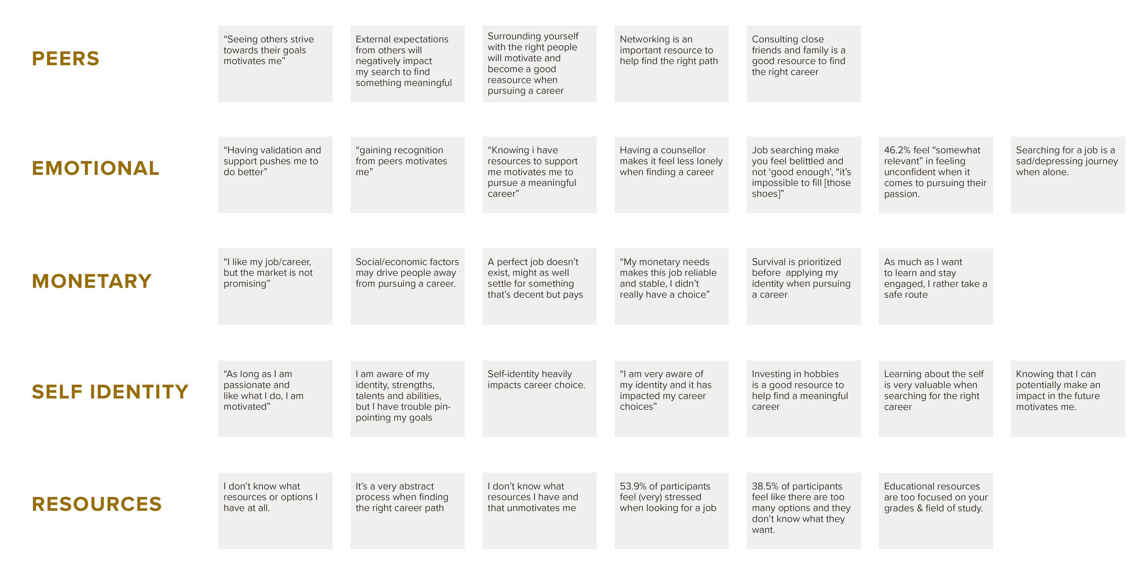
VALIDATED ASSUMPTION
- Participants agree that having a strong (vocational) identity impacts their career search.
INVALIDATED ASSUMPTION
- Research findings have concluded that 38.5% of participants lack vocational identity while the majority (46.2%) state having a strong sense of vocational identity/awareness
KEY INSIGHTS
Participants also agreed that career counselling is a good resource during the career search; however, many would rather seek support from personal friends and family. Based on survey findings, all participants have reported not feeling passionate and/or engaged in the work that they do; some quoting a lack in development and learning, and majority of participants say they do not feel like they can continue their current career and/or job in the long-term.
In conclusion, my problem space was invalidated based off survey findings, and I required to reframe my problem space and perspective.

PIVOT + MARKET RESEARCH
Based off research and survey findings, it was concluded that Millennials don’t feel fulfilled with their jobs, and many feel stressed and overwhelmed when it comes to finding resources to pivot and find a meaningful career. To determine an area of focus, I reframed my problem space to the following question:
How might we help millennials FIND PURPOSEFUL AND MEANINGFUL WORK so that they FEEL MOTIVATED AND ENGAGED in the work that they do?
It’s important that the question asked doesn’t pose a solution, but instead it gives us a framework to further explore and propose stronger design decisions later on. To start our exploration in addition to my previous survey findings, I researched the current climate of how Millennial’s work:
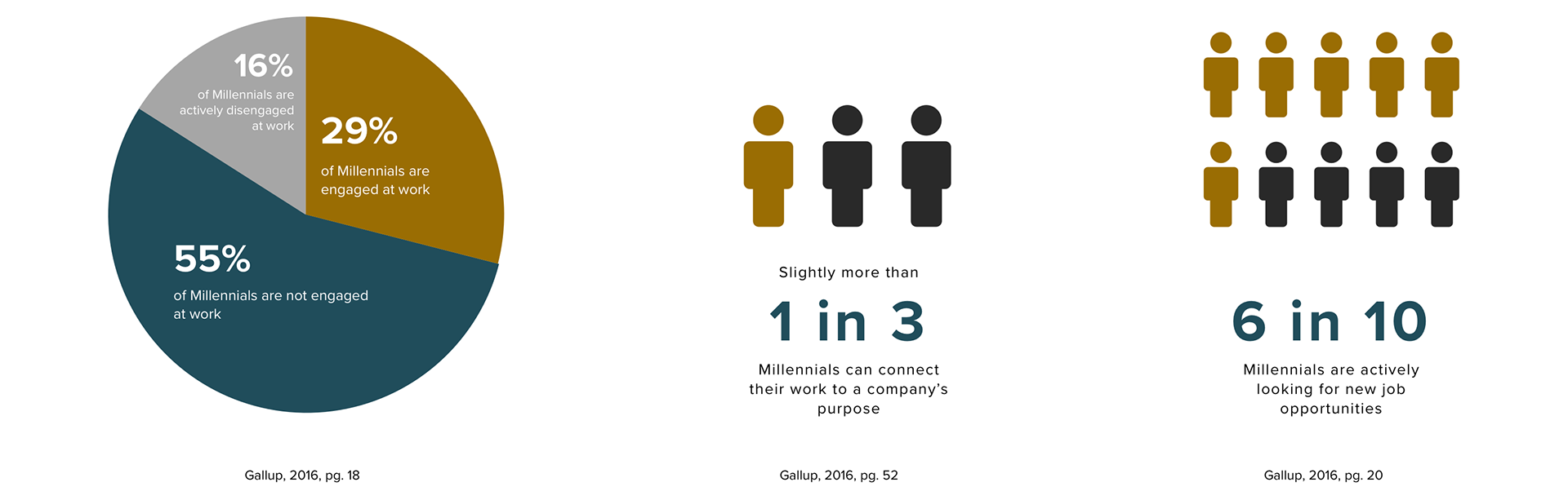
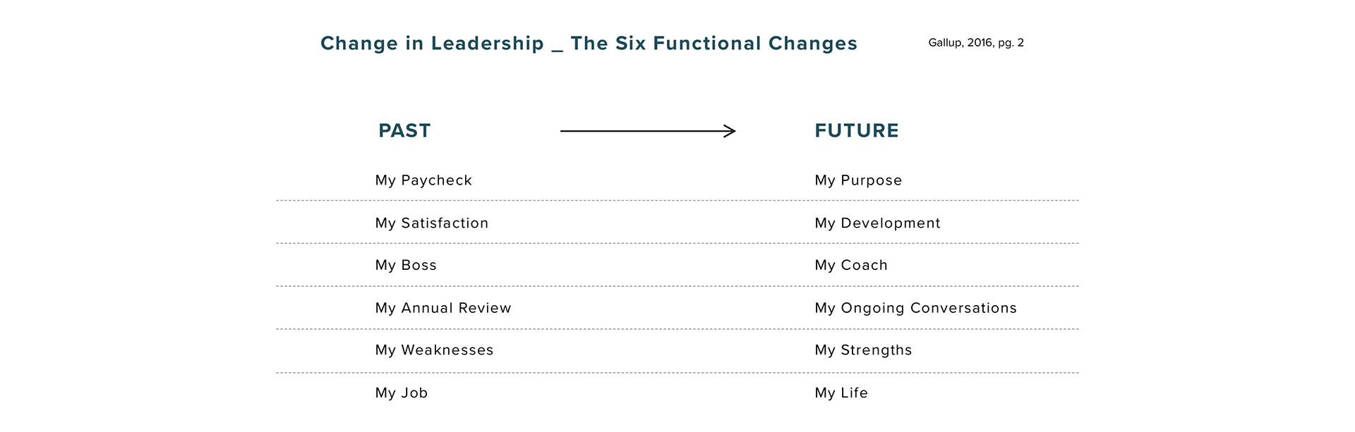
In addition to the statistics found, Gallup (pg. 2, 2018) notes that there are “Six Functional Changes” within organizational cultures. As Millennials are changing the “will” of the world, businesses should also adapt and change with it. In order to adapt to the Six Functional Changes, organizations need to start changing their leadership.
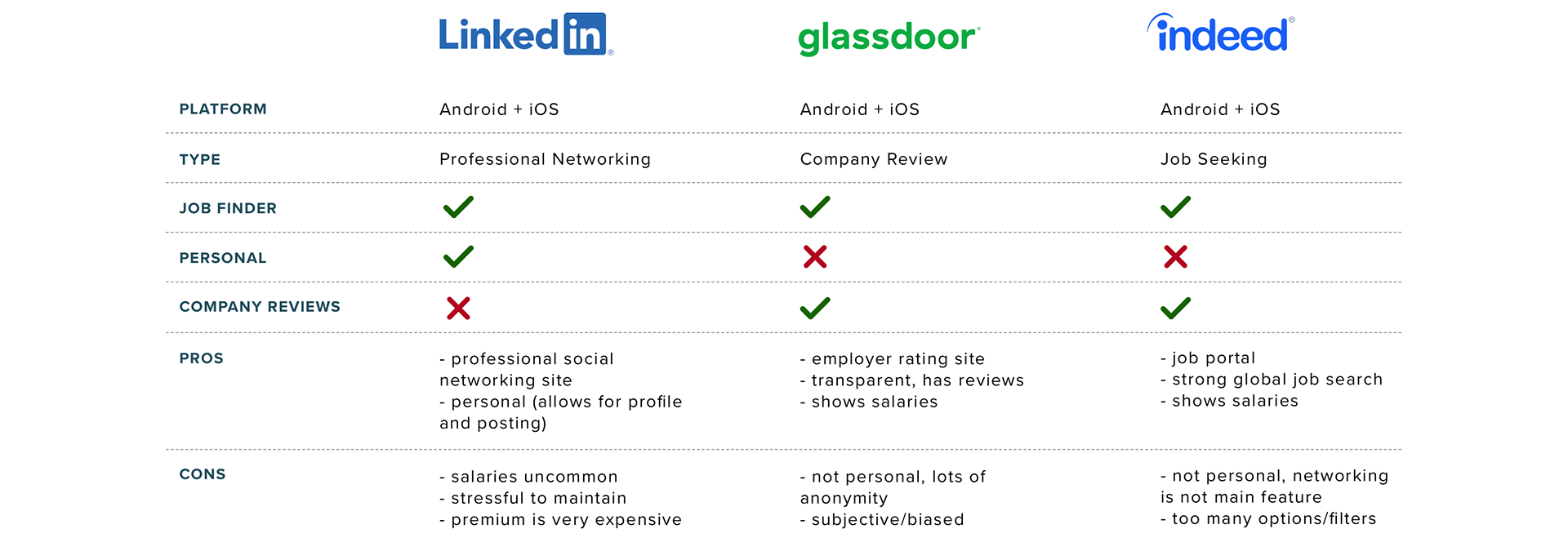
COMPETITIVE ANALYSIS
In order to to create a solution that was unique and worked for my target users, I had to first understand what already existed in the market, and what didn’t. Through this process, I was able to take what worked from my competitors and improve upon it. Rather than seeing competing applications as competition, I wanted to see them as partners, and how I could use these applications to my advantage.
Instead of creating a skillset based job hunting application, I wanted to focus more on the person behind the screen and their personality. Ideally, my design would be a combination of Glassdoor's transparency and incorporate LinkedIn's professional and personal approach.
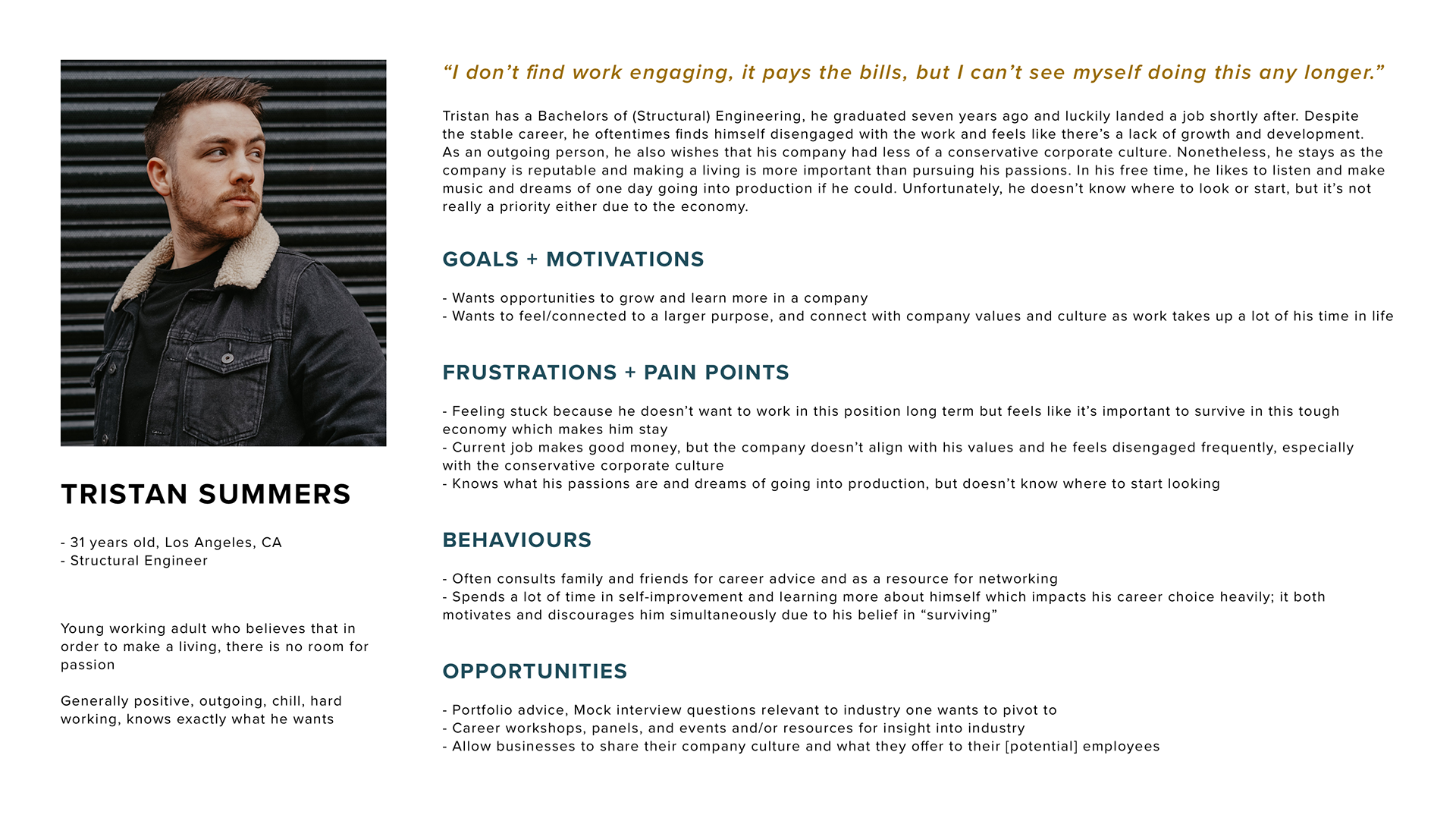
PERSONA
Based off of the user insights collected during the survey, a persona was created. This persona reflects the ideal target user for the product/solution and gives insight to their behaviours during a specific situation. It is used as a reference point to make sure the product/solution is aligned with what a user needs and helps create smarter design decisions.
DISCOVERING OPPORTUNITY
EXPERIENCE MAPPING
Experience mapping is used to understand a user's journey when trying to achieve a goal. It helps to discover areas of opportunity and how we can intervene and create a solution for a user's pain point during through their experience. It also gives an idea of how a user would potentially interact with the product and showcases their needs and wants.
Here, we see Tristan's experience map, he tells us:
"I want to pivot and pursue my dream career, it’s important that I’m able to find opportunities to grow and learn more in a company. I hope to also connect to a larger purpose and with a company's values and culture."
"I want to pivot and pursue my dream career, it’s important that I’m able to find opportunities to grow and learn more in a company. I hope to also connect to a larger purpose and with a company's values and culture."
We see how he goes about achieving this. The focal point has been highlighted to show our focus area and where our design solution can intervene to help alleviate his frustrations during his journey to pursue a new career.
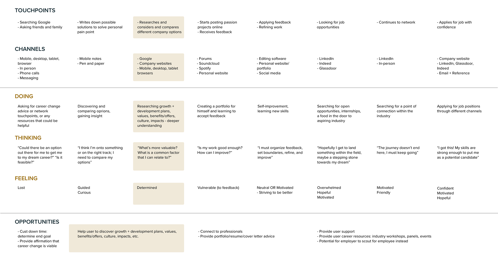
Click the image to enlarge
TASK SELECTION
Now that we determined who we’re designing for and what the problem is, we now have to determine what the solution is.
OBJECTIVE
The proposed design intervention should be a research tool in helping Millennials align their personal values with that of a company’s. When one can feel passionate and/or relate to a greater impact, they will feel more motivated and engaged in what they do. The proposed application should be a resource during the career search process. The proposed design solution should not be focusing on skillsets of a user but rather emphasize who the user is and what they stand for.
VALUE PROPOSITION
Align your values and seek greater impacts within companies to find a meaningful career.
USER STORIES + EPICS
To have a thorough understanding and see all perspectives of potential users, I created 24 user stories describing how a product feature could provide value to the user. Creating user stories helps designers better empathize with their users and suggest potential solutions to the problem, it also gives reasoning to why a function should exist. Following the creation of the 24 stories, I categorized them into four themes, otherwise known as an epic; An epic helps to determine a specific task in a work flow.
1. Resource
2. Support
3. Convenience
4. Transparency
1. Resource
2. Support
3. Convenience
4. Transparency
To best address my value proposition, I decided to focus on the fourth epic: Transparency. Here, I selected one user story in which would guide the work flow going forward:
"As a Millennial who wants to change their career, I want to know more about company growth and development so that I know how the company values their employees, and how I can grow."
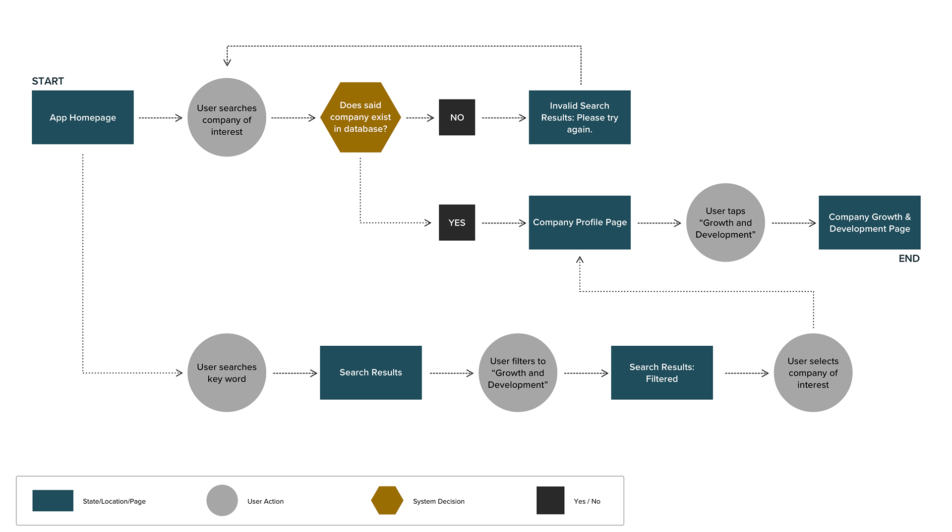
TASK FLOW
Using the user story noted above as a guideline, I determined a task flow in which my design would follow. A task flow is a series of steps in which a user would take in order to achieve an end goal. In this case, the user is trying to look into the information of a company and how they feed into employee's growth and development.
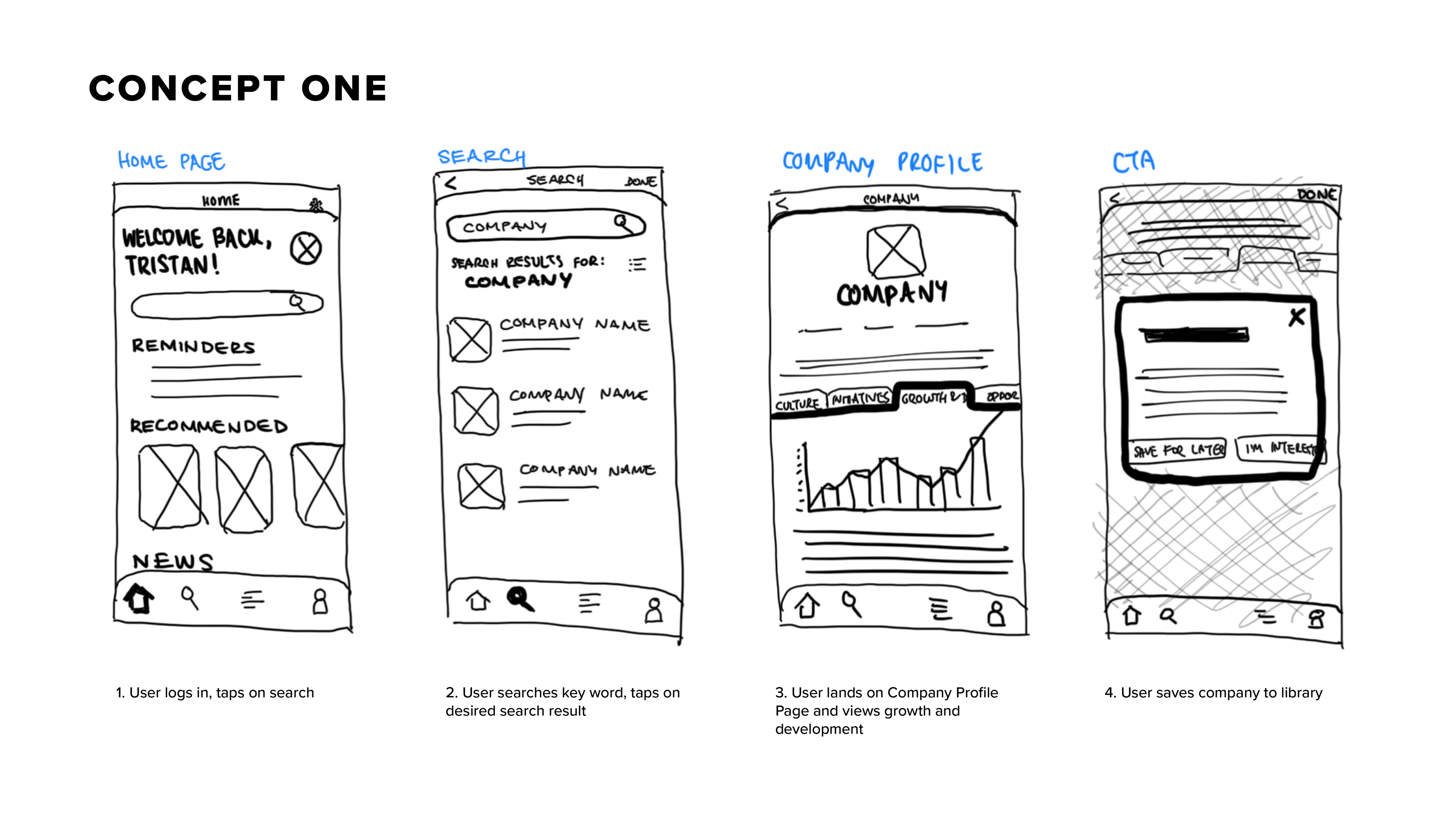
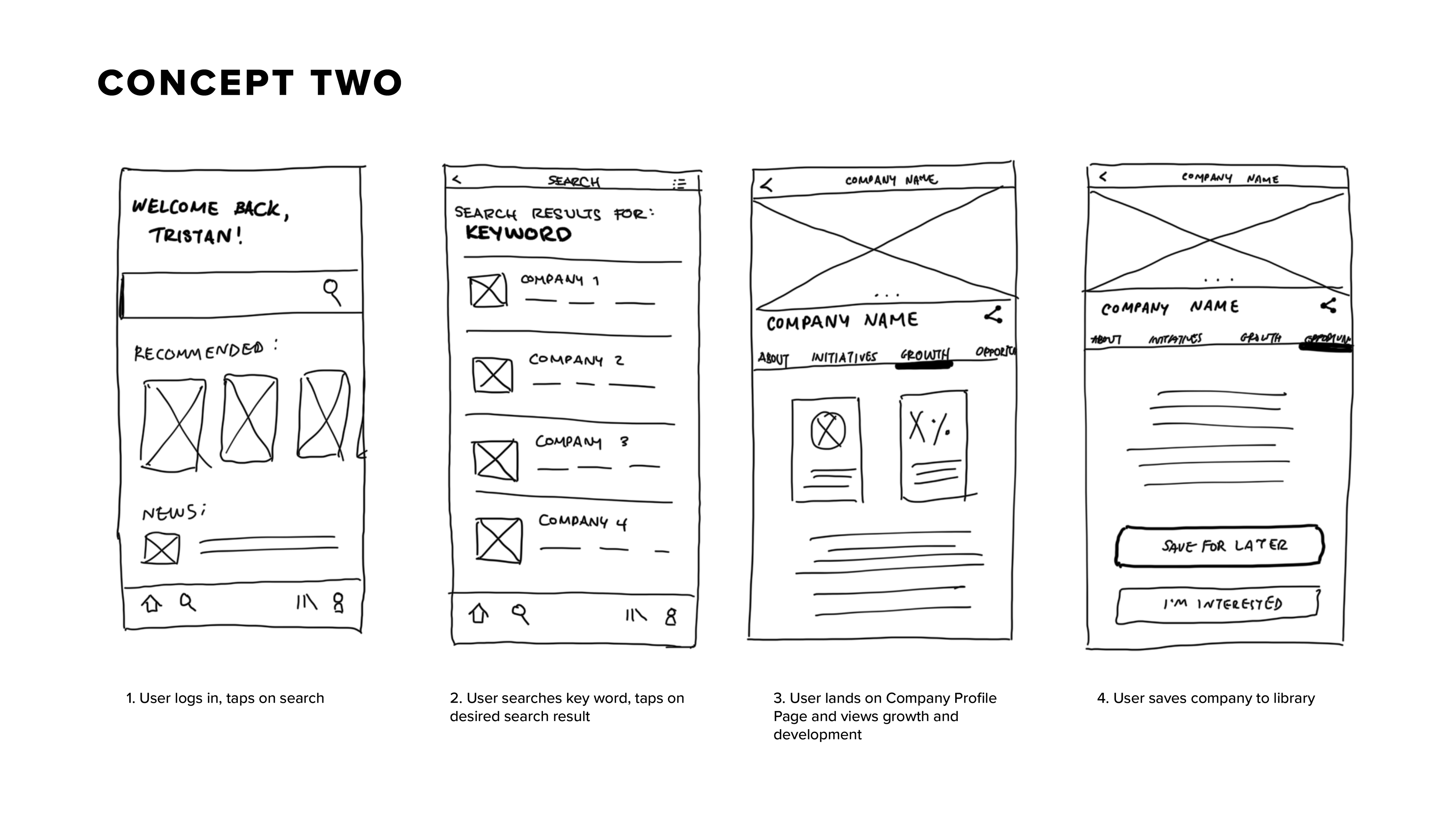
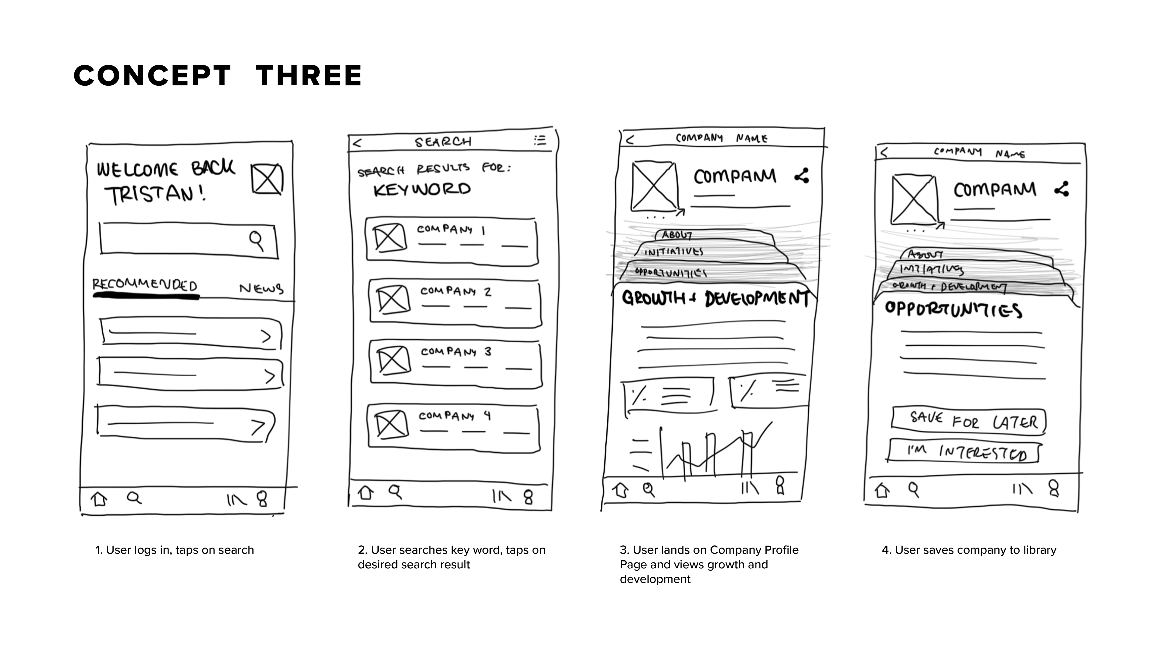
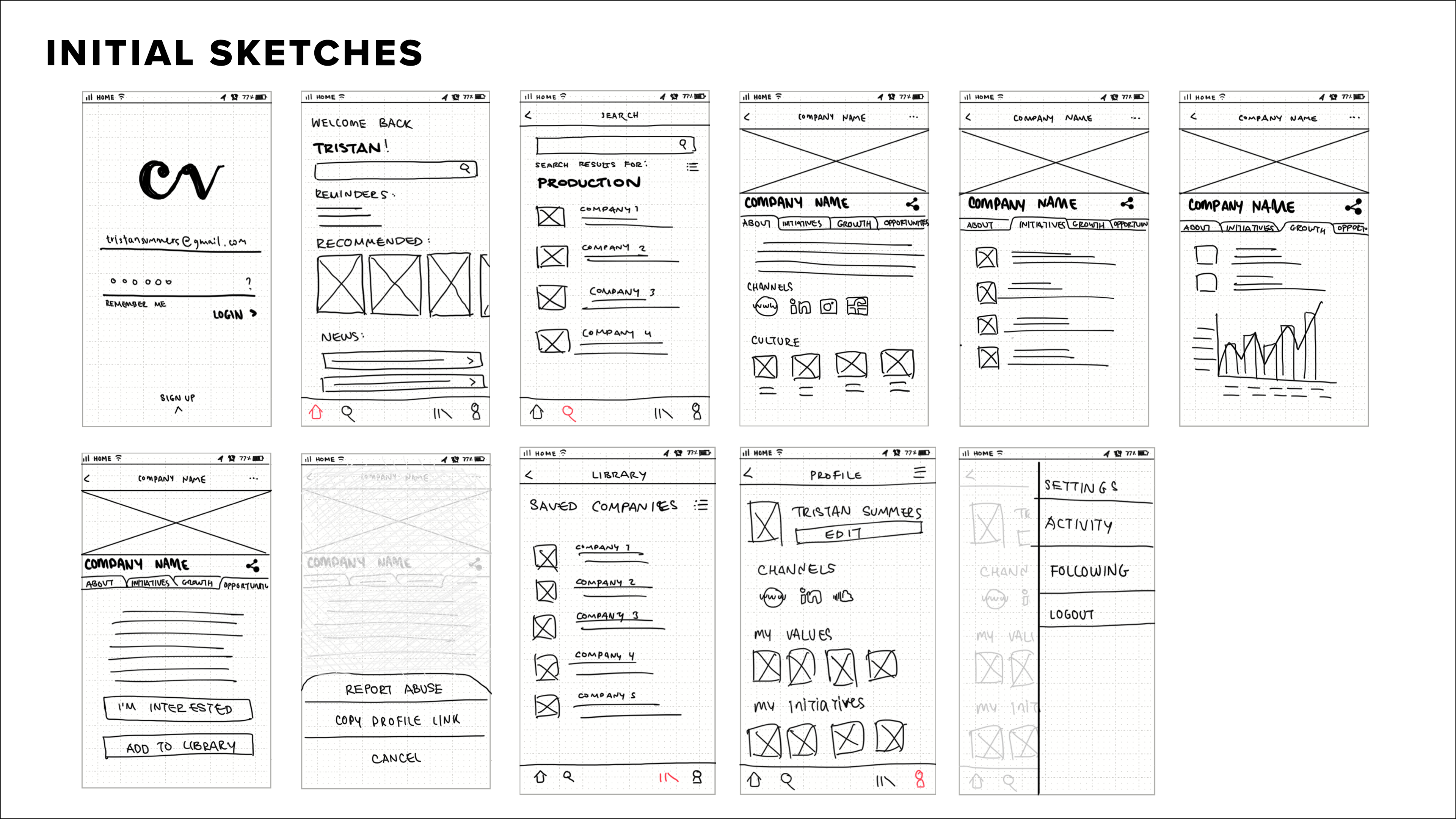
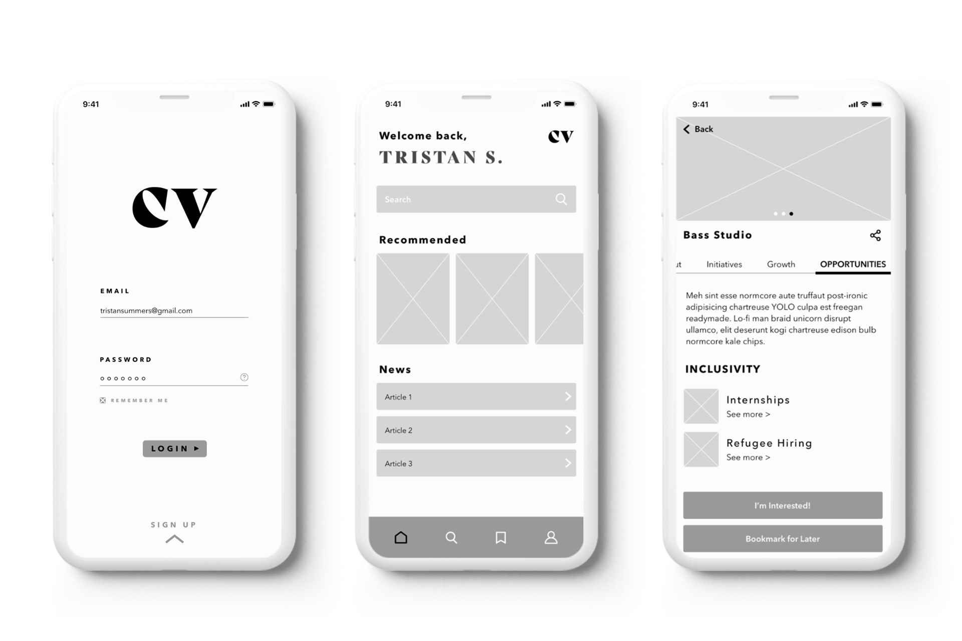
IDEATION + SKETCHES
After determining the task flow, it was time to ideate and sketch out potential designs. I knew a homepage and a search function was necessary for this app, as this was a resource tool for users to help find career. It was also important to find a way to organize heavy content easily so users could easily follow and skim through the content if they needed. Ultimately, I ended up going for a mix between concept one and two, an interface that was minimal yet organized.
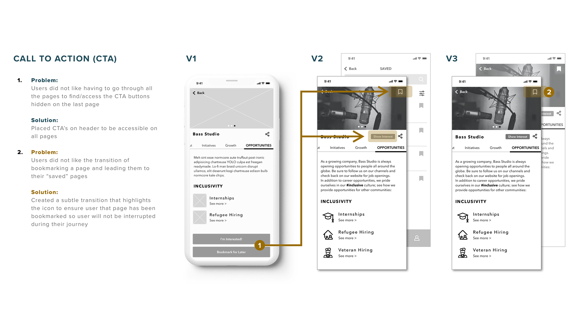
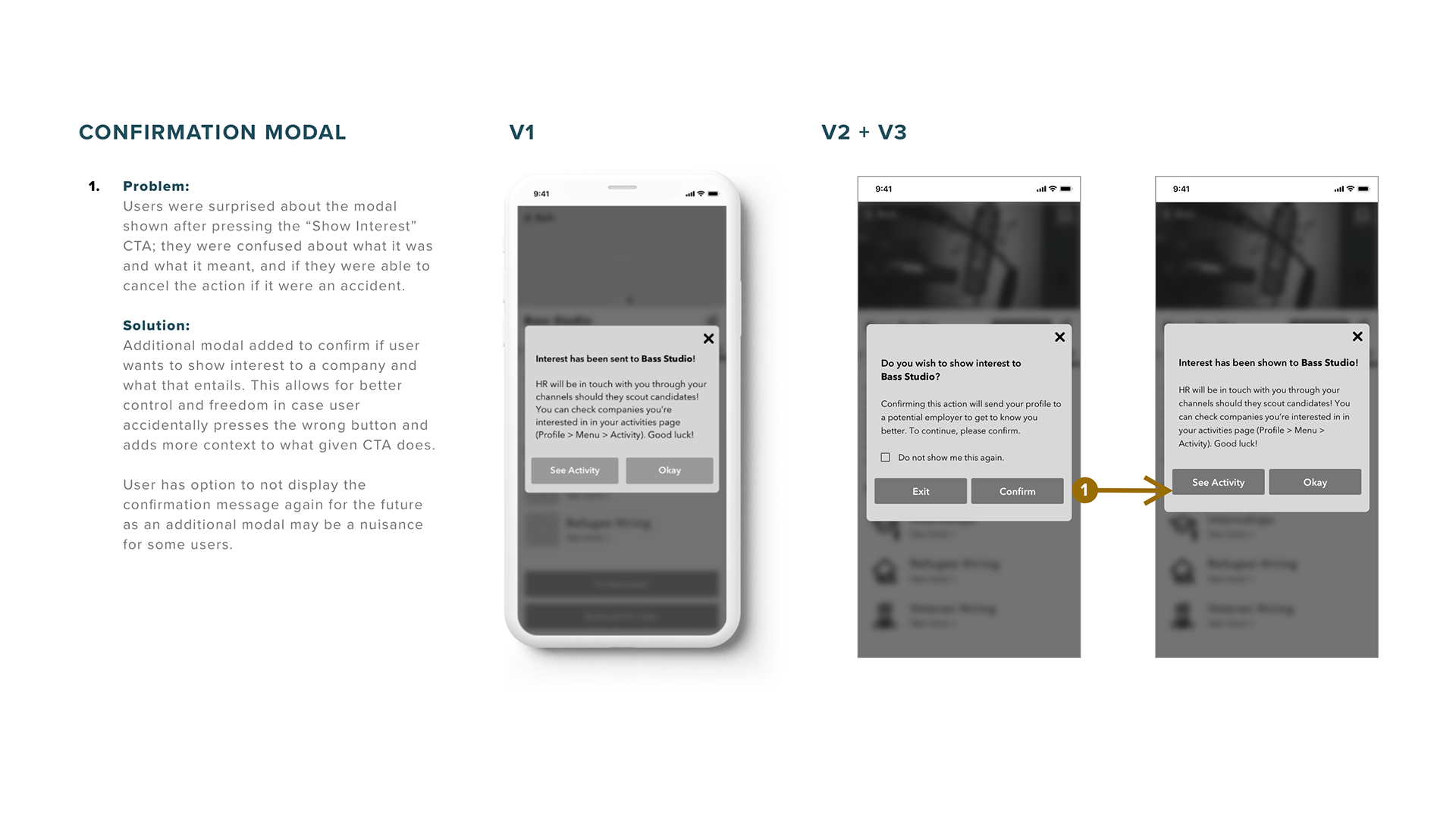
USABILITY TESTS + CHANGES
Once satisfied with my sketches, I proceeded to create a digital prototype of the design to test. I conducted two rounds of usability tests, in which a user was called in and asked to a complete a series of tasks within the prototype. During these tests, I asked users to search for a company and look into their growth and development page, bookmark/save the company for later reference, and asked them to show interest in the company. Doing so would allow employers to see your profile, and potentially allow the user to be scouted out for future opportunities with said company.
Seen below are the evolutions of iterations and changes made based off of feedback received during these tasks (click images to enlarge). A major concern that was addressed was how a user went about bookmarking/saving a company profile for later reference. Other changes made included how the search page was organized, and how a user could be understand what "show interest" meant.
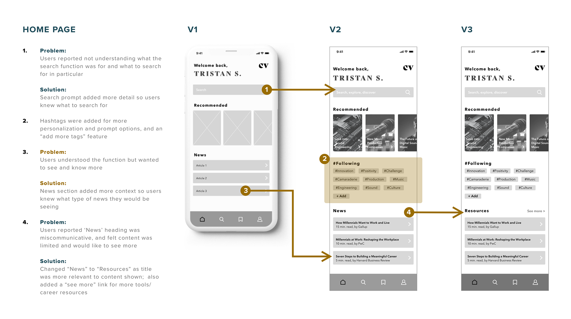
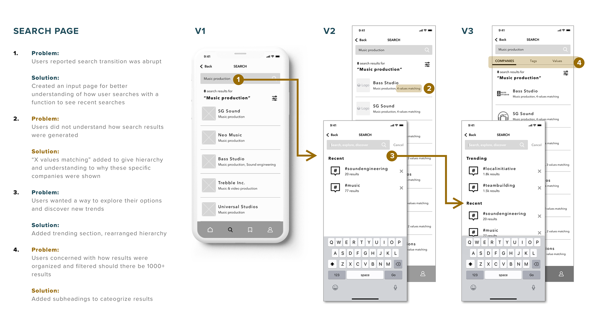
Click the links below to see the iterations of prototypes after conducting usability tests! (Links will open in a new window)
V 1 - Low Fidelity
V 2 - Mid Fidelity
V 3 - Mid Fidelity

VISUAL IDENTITY STORY + BRANDING
VISUAL IDENTITY
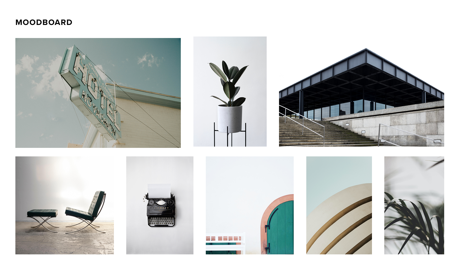
Speaking to who and what this application was designed for, I wanted the visual identity to evoke a feeling of professionalism but with a modern touch. I wanted it to speak to its structure and minimalism as well. As my target users are Millennials, I wanted the visual identity to be unique and bold, thus I chose a teal colour to represent the brand. By creating a moodboard it helped me gather images, words, and colours that could help build my design's visual identity and branding.
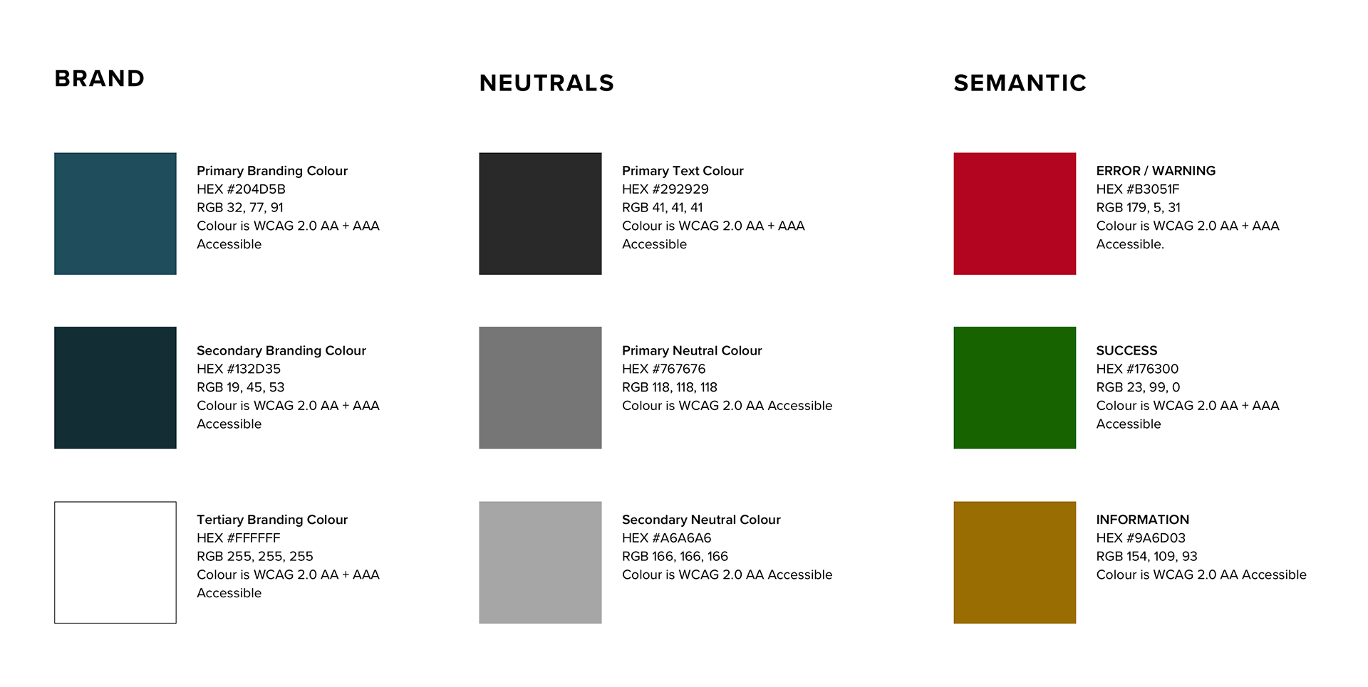
COLOUR PALETTE
Keeping to the minimal interface and identity, I kept the colour palette as simple as I could. During the colour selection process, the most important consideration was making sure the colours were WCAG Accessible. WCAG stands for Web Content Accessibility Guidelines, which helps make web content more accessible for those with disabilities (for example: colour blindness). See WCAG Accessible colour contrast breakdown.
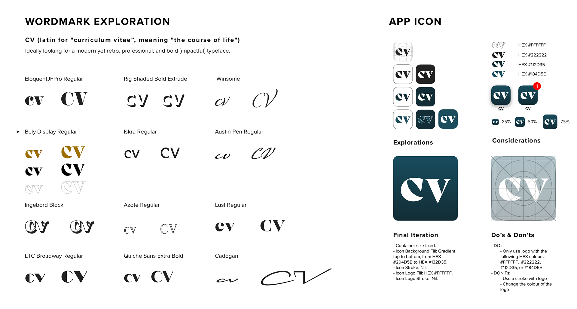
BRAND NAME + WORDMARK
When I thought of careers, the idea of résumés and CV's popped into my mind. CV (short for curriculum vitae in latin) means "the course of life", as my design focused on values, growth, and impacts, I thought it was fitting. Short, memorable, and bold, I wanted the wordmark to reflect it as well. Through an exploration of typefaces, I chose a classic serif font with a modern twist.
APP ICON
As the interface I designed was for Apple iOS mobile devices, I created an app icon based off of Apple's Design Resources. Using the brand colours, I explored multiple colour combinations and finalized on a soft gradient which I felt gave the icon more depth.
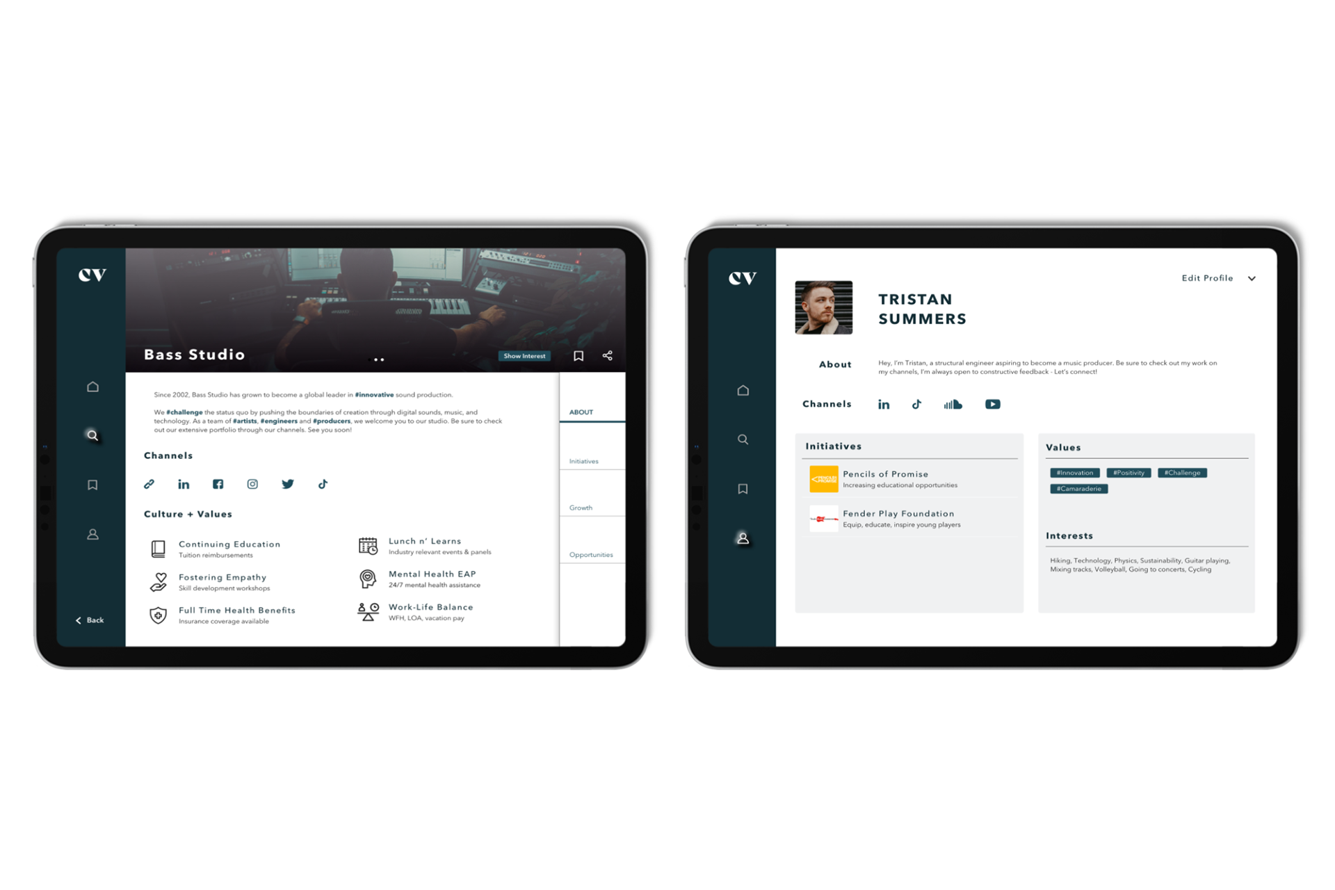
USER INTERFACE LIBRARY
Once I defined my brand and visual identity, I was able to start applying this throughout the design components and interface to create a hi-fidelity prototype. To ensure visual cohesiveness, I created a style guide and user interface library for reference during the phases of development.
See the full UI library/style guide.
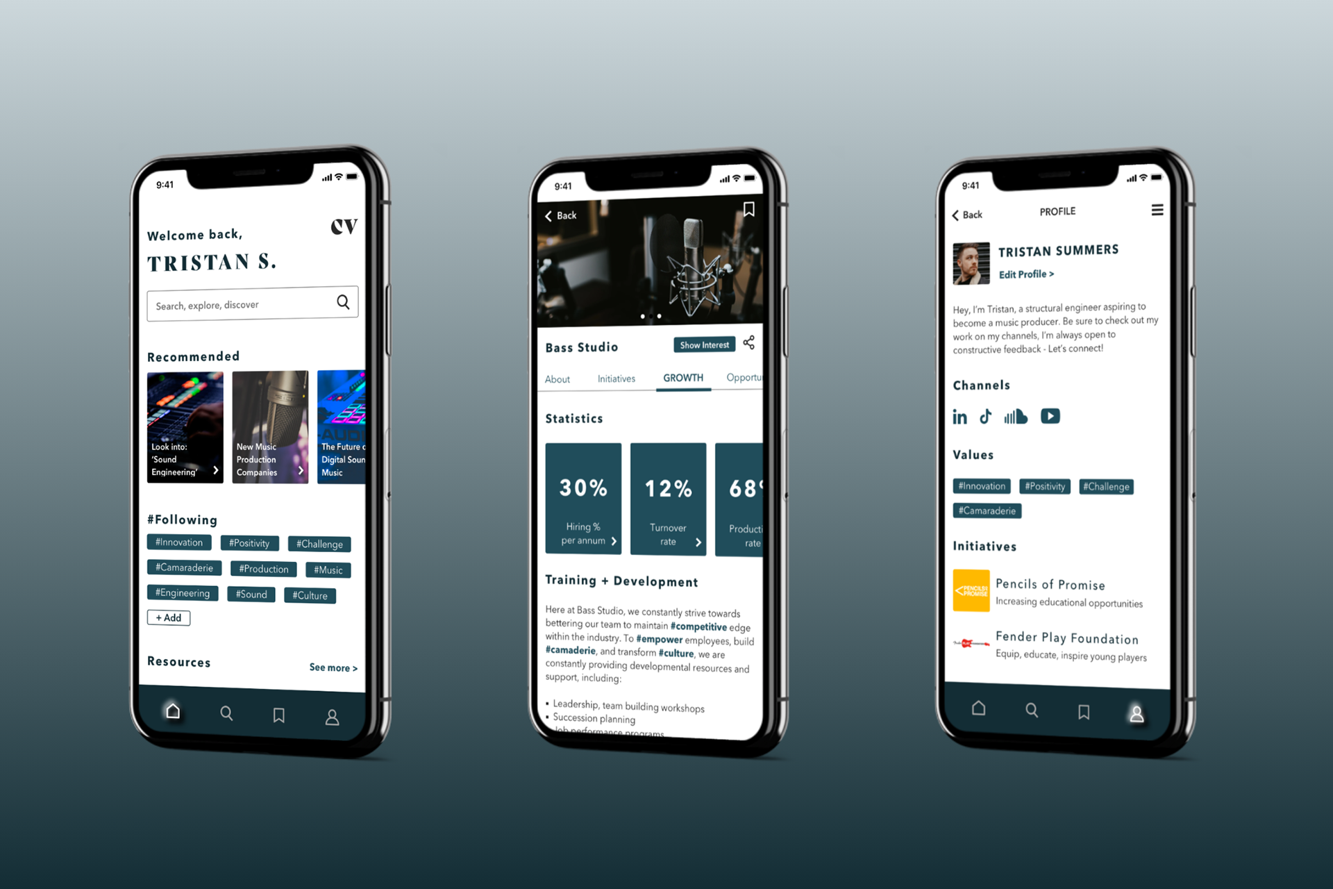
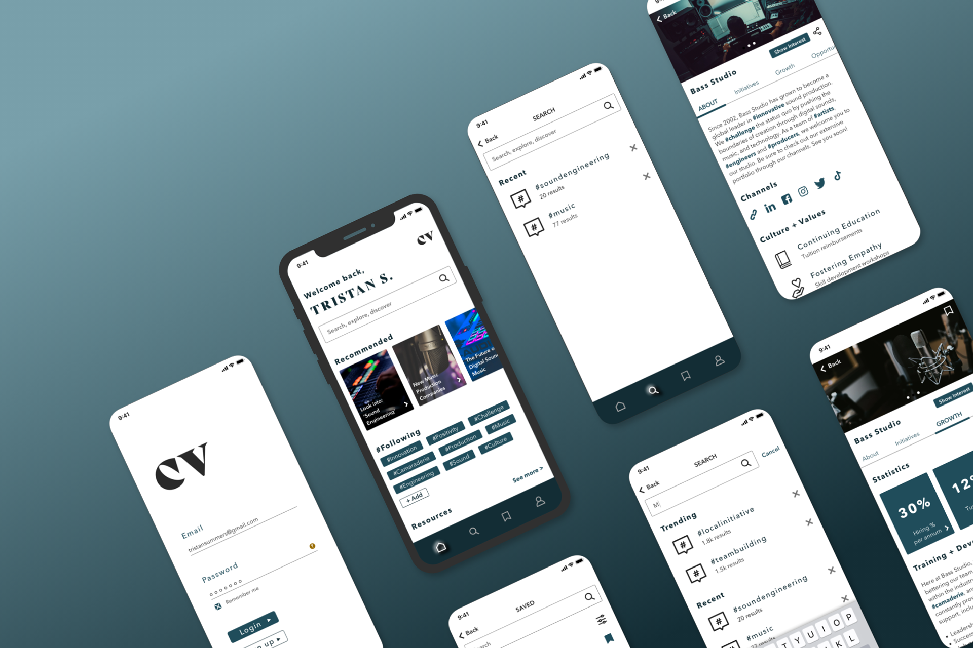
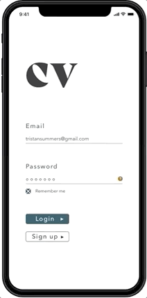
HI-FIDELITY PROTOTYPE
In the final iteration of the application, colour was added and slight adjustments were made, including:
- Adding a search-landing page before a user inputs
their search
- Fixing spacing and padding/margins
- Adjusting page transitions
- Adding a search-landing page before a user inputs
their search
- Fixing spacing and padding/margins
- Adjusting page transitions
Click the button below to view the InVision Prototype:
Prototype Preview
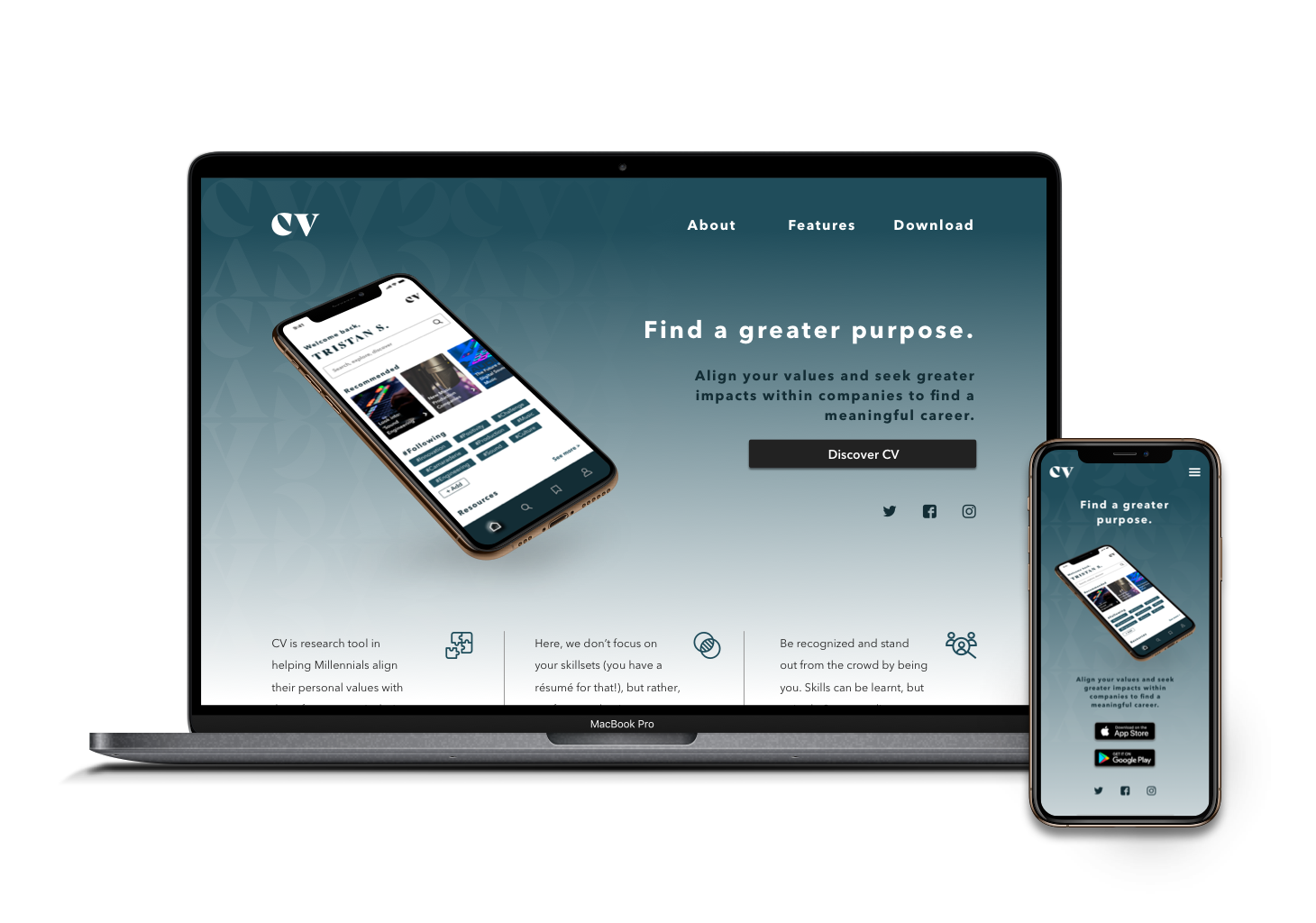
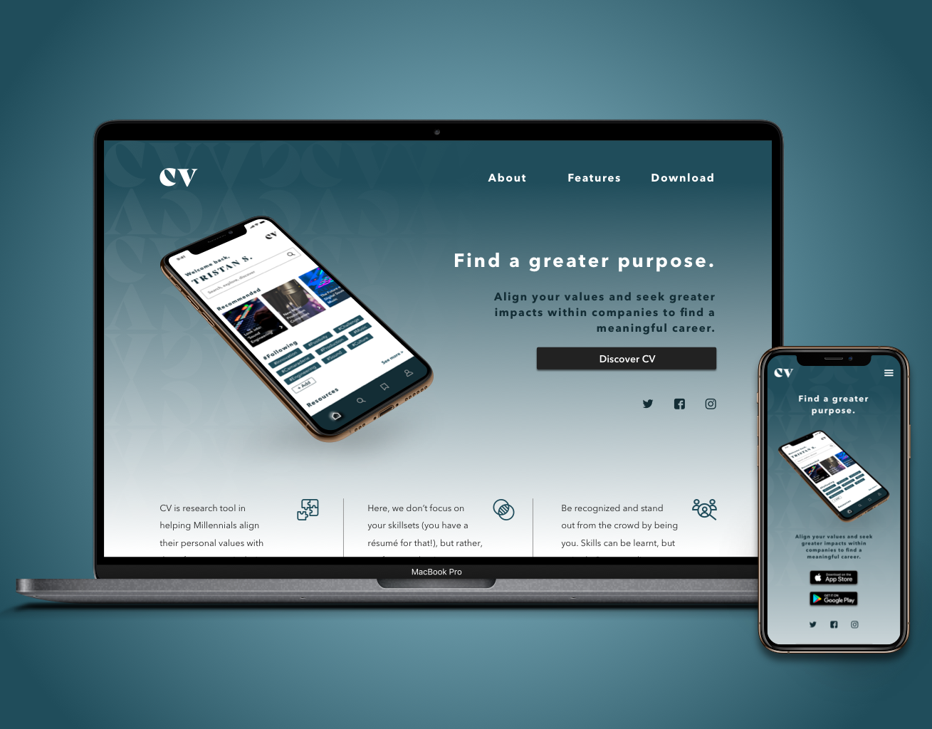
PRODUCT MARKETING WEBSITE
In order to market this application, a responsive product marketing website was developed for both desktop and mobile devices.
See the mobile prototype and/or the desktop prototype.
To learn more about the design process of the marketing website, please check the CV Marketing Site portfolio piece.
MULTI-PLATFORM CHALLENGE
In addition to the native mobile application, I challenged myself to think further on how my persona may use the application on a different platform. As Millennials oftentimes own more than one smart device, I decided to create a tablet version of CV.
DESIGN IMPACT:
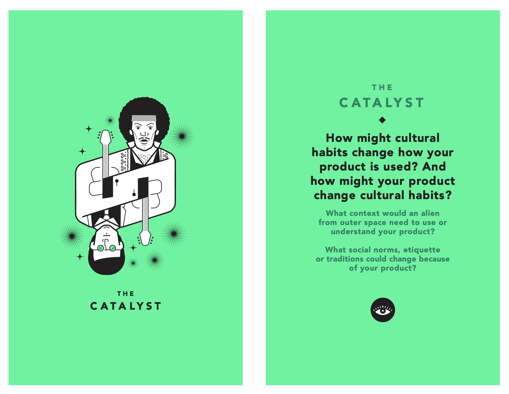
TAROT CARDS OF TECH
TAROT CARDS OF TECH
THE CATALYST
It's important to have a good understanding of what one values and/or wants from their future career in order to understand CV. As Millennial values change and reshape societal cultures, CV will be the next step in rethinking the career search process and strengthen the employer-employee relationship.
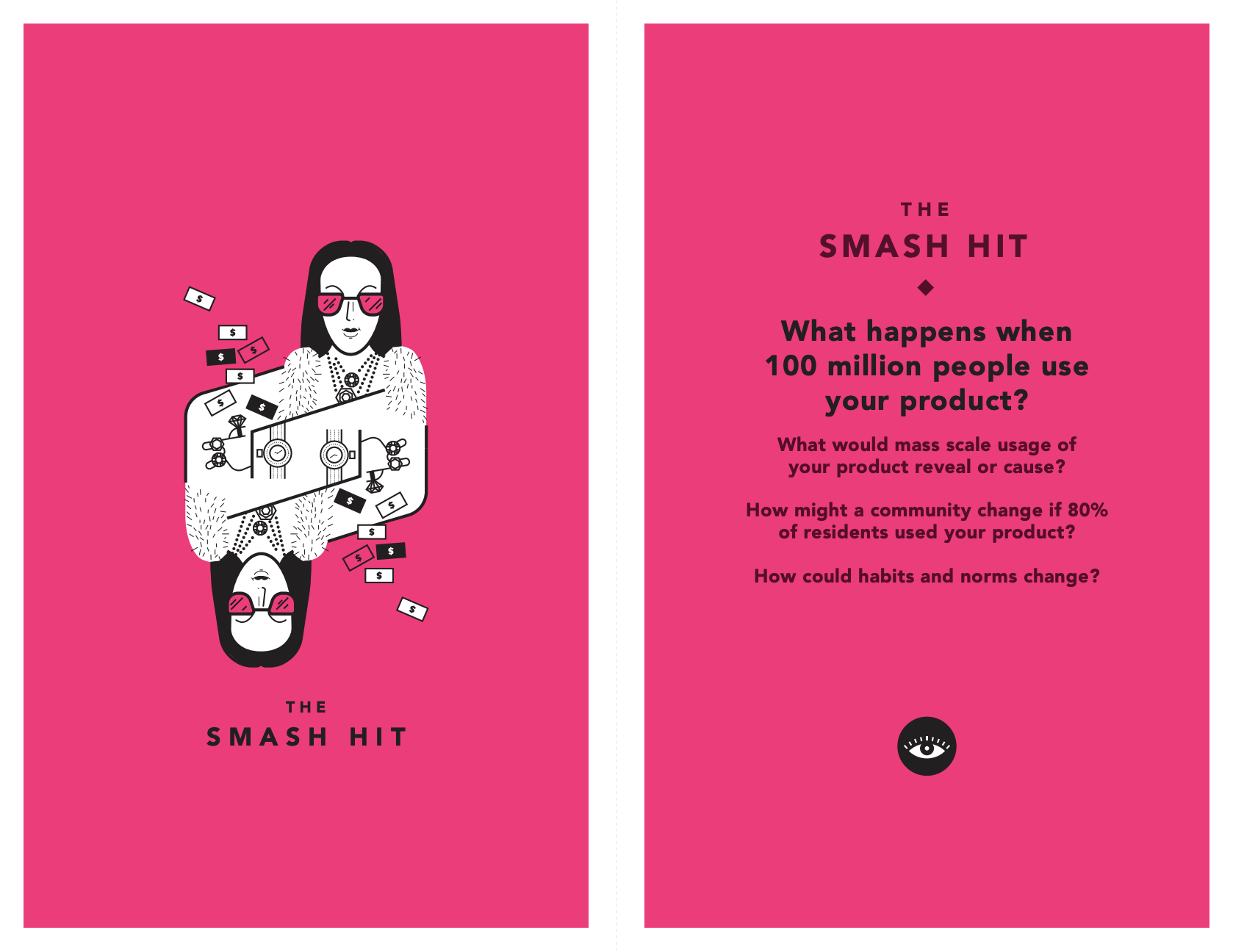
THE SMASH HIT
If 100 million users were to use this product, CV would become a catalyst in redefining what it means to have a "meaningful career". Employers would need to reshape and strengthen their values and cause, and employees would have an increase in engagement, happiness, and productivity. CV would reveal the good, bad, and ugly of toxic (and healthy) work environments, and cause a shift in hiring processes as well.
FUTURE DEVELOPMENT
With the given time constraints for this project, the current state of CV has only considered one task flow for the primary persona. Should CV continue to be developed, it would be important to consider:
USERS
- Data collection and privacy concerns
- How a business would use this app and control their profile in comparison to a regular user
- Consider further developing/adding task flows for a secondary persona
- Test to see what else users would like to see and/or how the task flow can be improved
- Data collection and privacy concerns
- How a business would use this app and control their profile in comparison to a regular user
- Consider further developing/adding task flows for a secondary persona
- Test to see what else users would like to see and/or how the task flow can be improved
BUSINESS
- A means for revenue: ads, sponsorships, premium, etc.?
- Stickiness: How would CV maintain the user base and have users come back to use the application after being
hired?
- A means for revenue: ads, sponsorships, premium, etc.?
- Stickiness: How would CV maintain the user base and have users come back to use the application after being
hired?
FEATURES
- Streamlining the application to have everything in one app (ex. resume, skillsets, a form of contacting the user)
- Notification/Direct message feature so companies can directly contact potential candidate for job offers
- A way to apply to specific job positions/roles within a company
- Streamlining the application to have everything in one app (ex. resume, skillsets, a form of contacting the user)
- Notification/Direct message feature so companies can directly contact potential candidate for job offers
- A way to apply to specific job positions/roles within a company
DEVELOPMENT
- Iterate, iterate, iterate; it never ends!
- Hand off (designs + mockups) to a developer with a style guide
- Bring the prototype to life with animations, videos, and transitions
- Iterate, iterate, iterate; it never ends!
- Hand off (designs + mockups) to a developer with a style guide
- Bring the prototype to life with animations, videos, and transitions

KEY PROJECT LEARNINGS
In just 10 weeks, I had the opportunity to learn how to identify a problem, solution, and experience the design process from start to finish. What stood out to me through the design process is what it means to be empathetic. It's important that as designers, we understand the meaning and reasoning behind what we do, and that design is meant to be shared. Some key takeaways from this project included:
SETTING BOUNDARIES
- Set boundaries within constraints: within the given time constraints, I had to make sure not to address all suggestions from the usability tests as it wouldn’t be feasible/realistic to apply
- Set boundaries within constraints: within the given time constraints, I had to make sure not to address all suggestions from the usability tests as it wouldn’t be feasible/realistic to apply
DESIGN FOR THE USER
- Know who you’re designing for: it’s easy to get carried away with many ideas and suggestions; it’s always important to remember/reference who and what your persona and task flow needs
- Know who you’re designing for: it’s easy to get carried away with many ideas and suggestions; it’s always important to remember/reference who and what your persona and task flow needs
FEEDBACK
- Recognize that you don’t have the answers to everything: prototypes are still a work in progress and it’s okay to say “I don’t know” or "I don't have the answer/solution to that [yet]"
- Always be open to feedback and constantly ask for it no matter how confident and/or comfortable you feel about your layout and design, there’s always something to improve!

REFERENCES
Bean, S. (2017, August 18). Almost a quarter of Millennials are unhappy in their current work situation. In insight.. Retrieved from https://workplaceinsight.net/almost-a-quarter-of-millennials-are-unhappy-in-their-current-work-situation/
Gallup. (2016). How Millennials Want to Work and Live (pp. 18-52). N.p.: Gallup, Inc.. Retrieved from https://www.gallup.com/workplace/238073/millennials-work-live.aspx
Vocational Identity. (2020). In Psychology. Retrieved from http://psychology.iresearchnet.com/counseling-psychology/identity-development/vocational-identity/